
How colour in your wedding transforms your photos


Colour! Boom! 🎊🌈
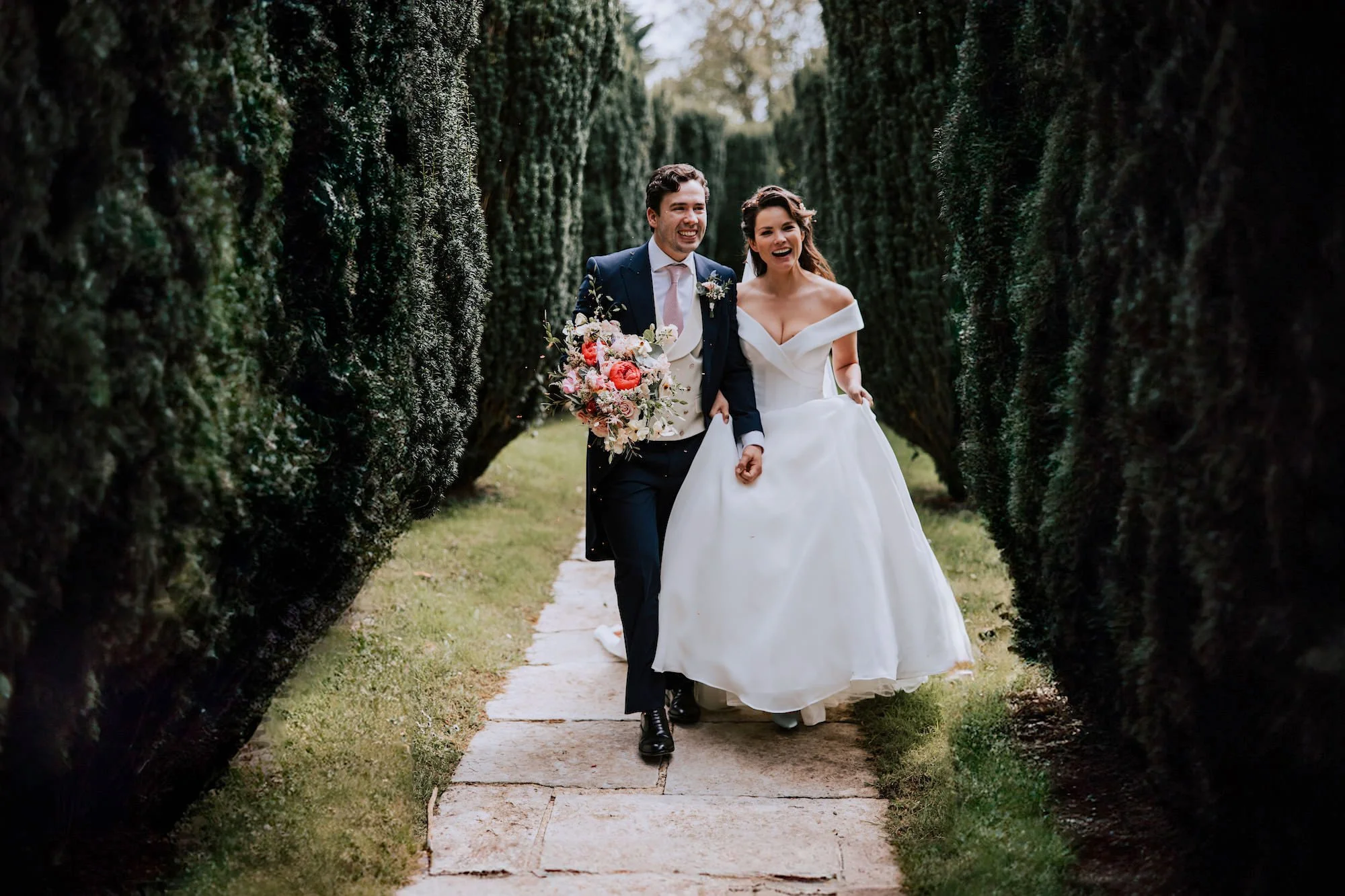
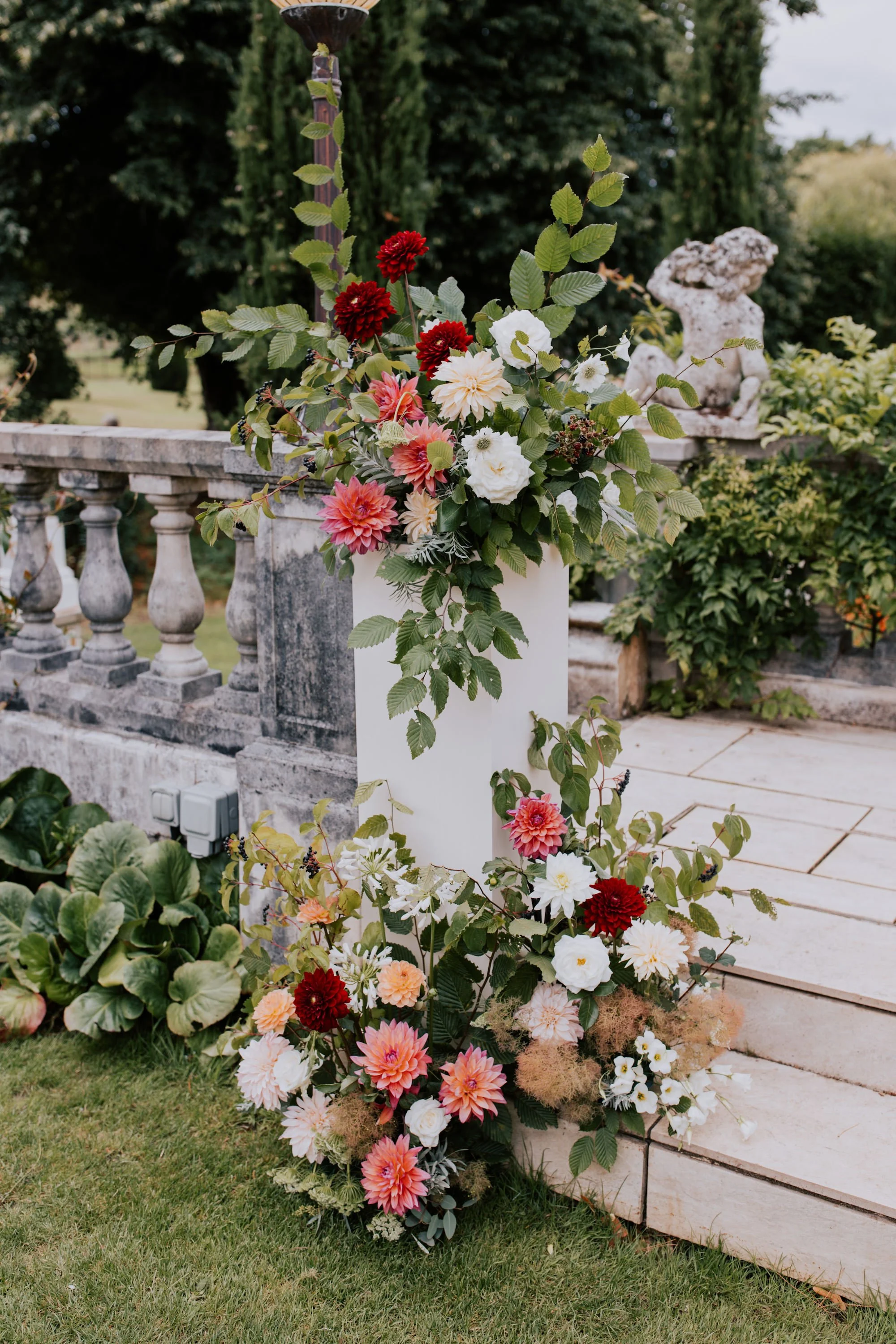
It’s no secret that I love colourful wedding days, as a little bit of colour goes a long way to make impactful wedding photos. Whether it’s bright or vibrant colours in the floristry or details, or even patterns within ties or stationery, injecting some colour makes a huge difference to how your wedding photos look. Even being a little bit bold transforms ordinary-looking wedding photographs to ones that leap off the page!
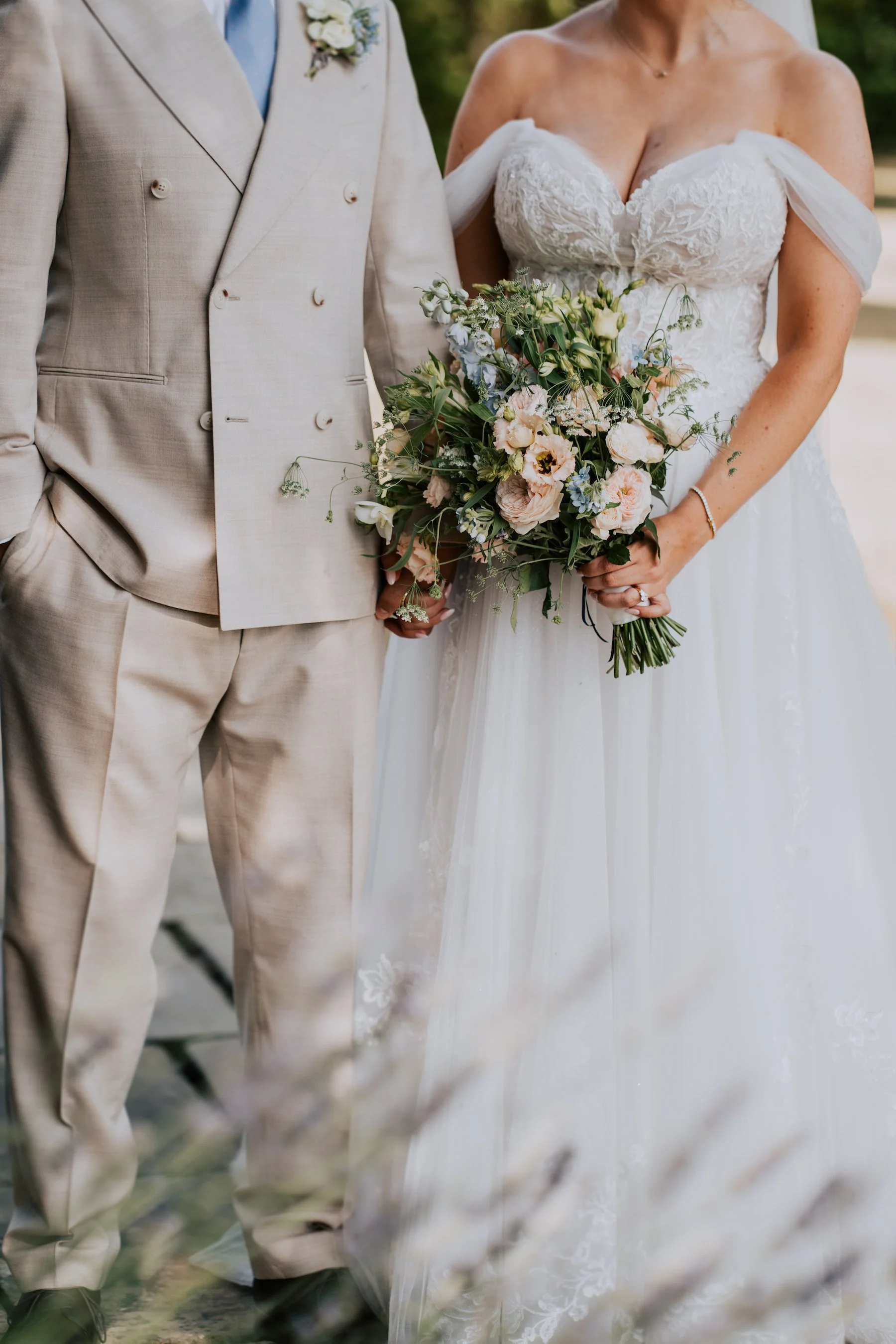
It’s not to say that weddings without bright or vibrant colours are ordinary – absolutely not – and it’s important to note that bold injections of colour don’t always work in certain situations. Keeping things simple with classic whites and greens often looks sophisticated and elegant, and that colour palette can have a calming effect. But having a vibrant or colourful palette doesn’t make things any less sophisticated!
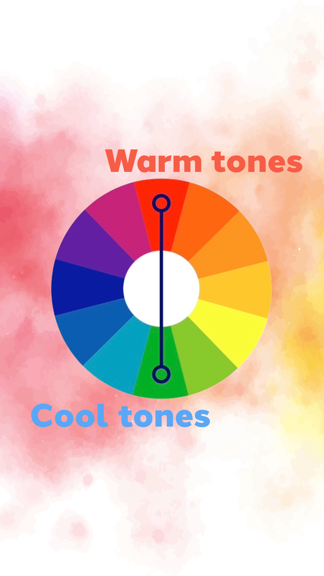
For the purposes of this blog post, when I say colour, I’m talking about anything that isn’t black or white, and to help you here’s a visual aid: the colour wheel. Colour wheel image courtesy of Dulux.

The colour wheel comprises three main or primary colours: red, blue and yellow, and the secondary colours: purple, green and orange. The colour wheel then comprises warm and cool colours; reds, oranges, yellows and some pinks being warm, and blues, greens and some purples being cool.
What does it mean?
Opposites on the colour wheel tend to complement each other very well. They lift or add punch to a primary colour which might otherwise look fairly plain by itself. Too much of just one tone, even in varying shades, can make things look blocky or meh.
Personally, I think an injection of colour really makes the photos pop *chef kiss* 👌🏼
Consider your theme and surroundings
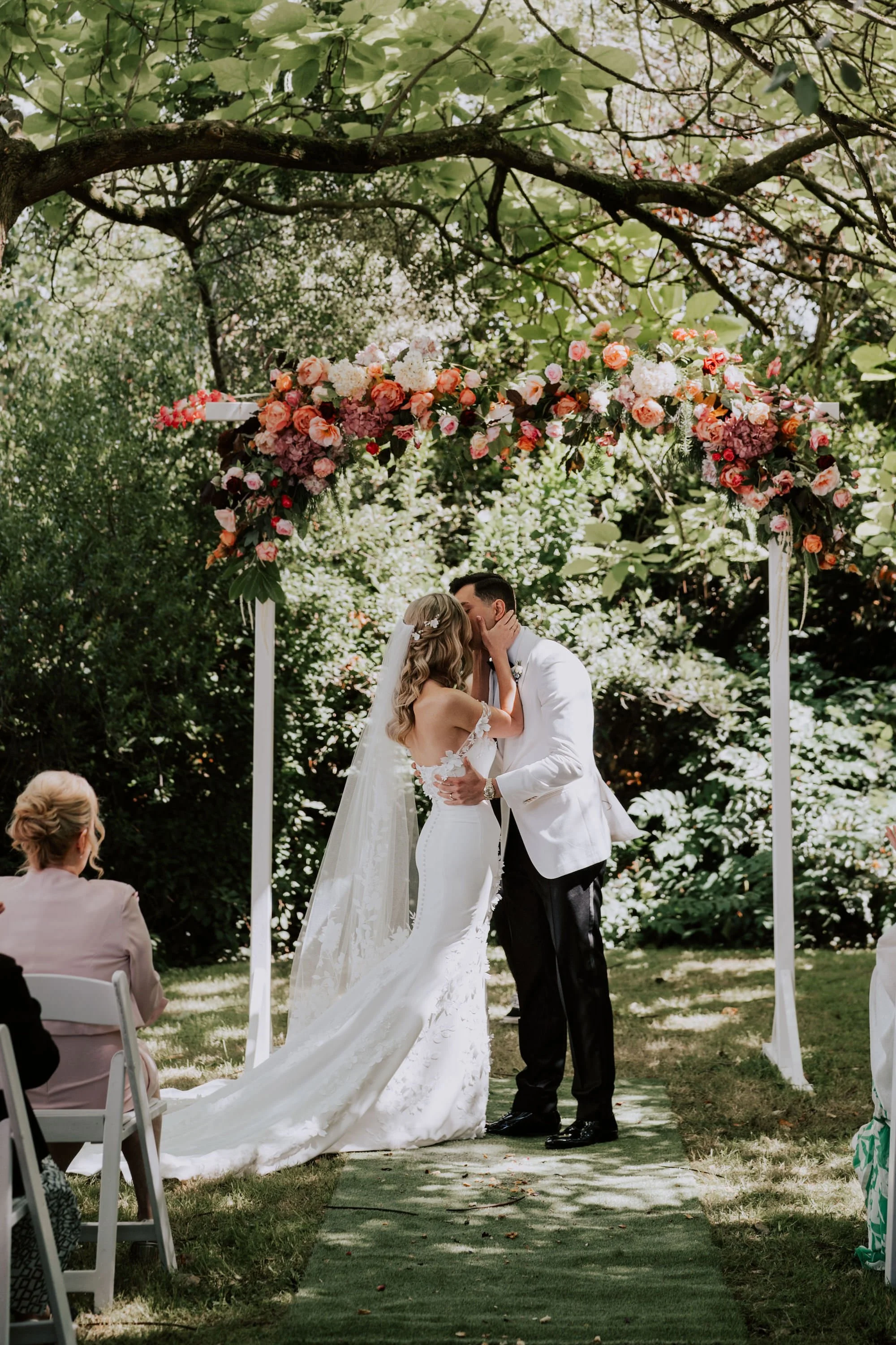
Be sure to consider your venue and surroundings. Consider how a wedding venue background works with your colour scheme. Are there flowers in bloom, providing some colour? Is it dark wood everywhere? Is it a wide open space of purest green grass and nothing else? How will your colours look against your chosen backdrop?
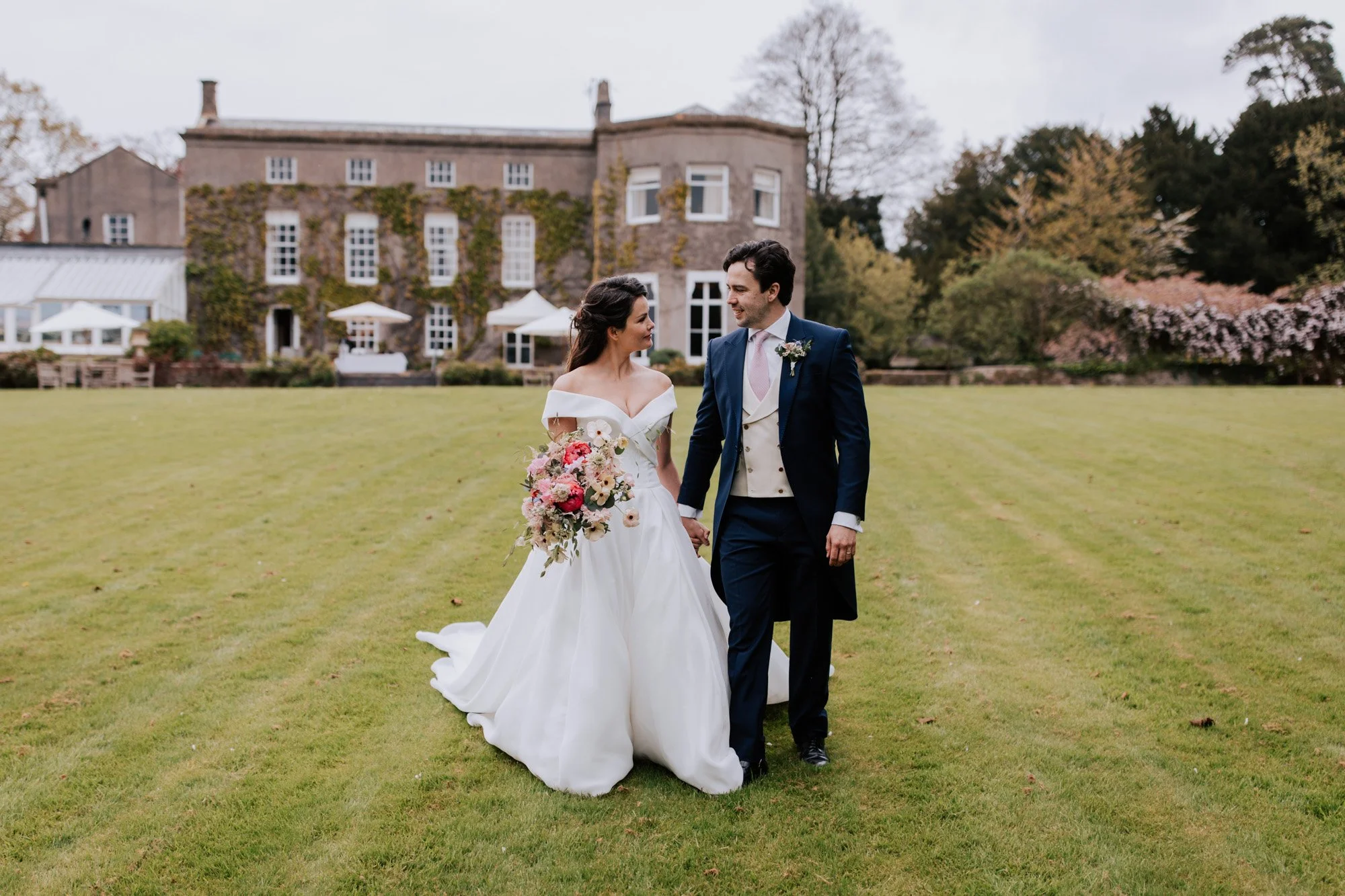
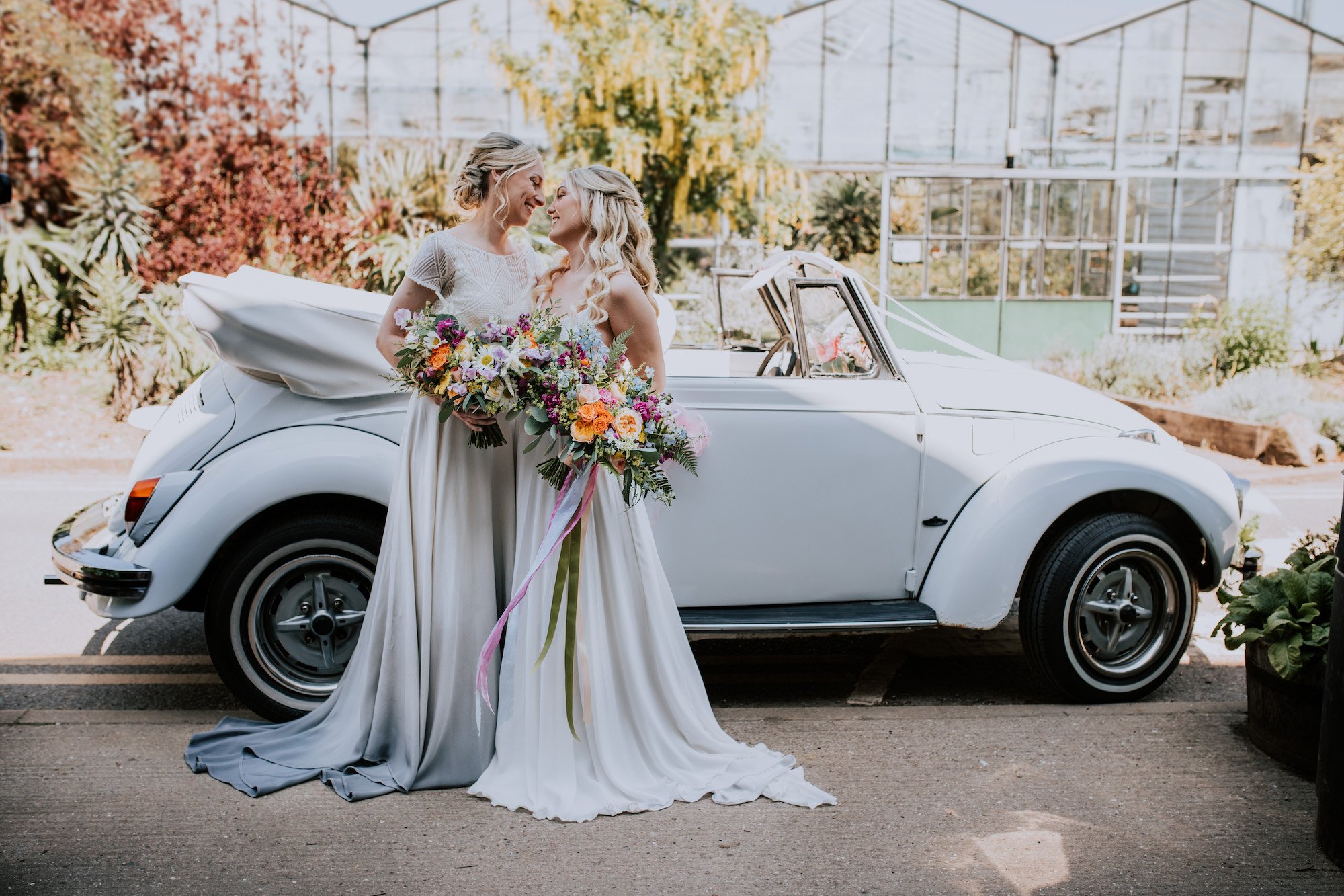
A bit of colour adds vibrancy and punch.
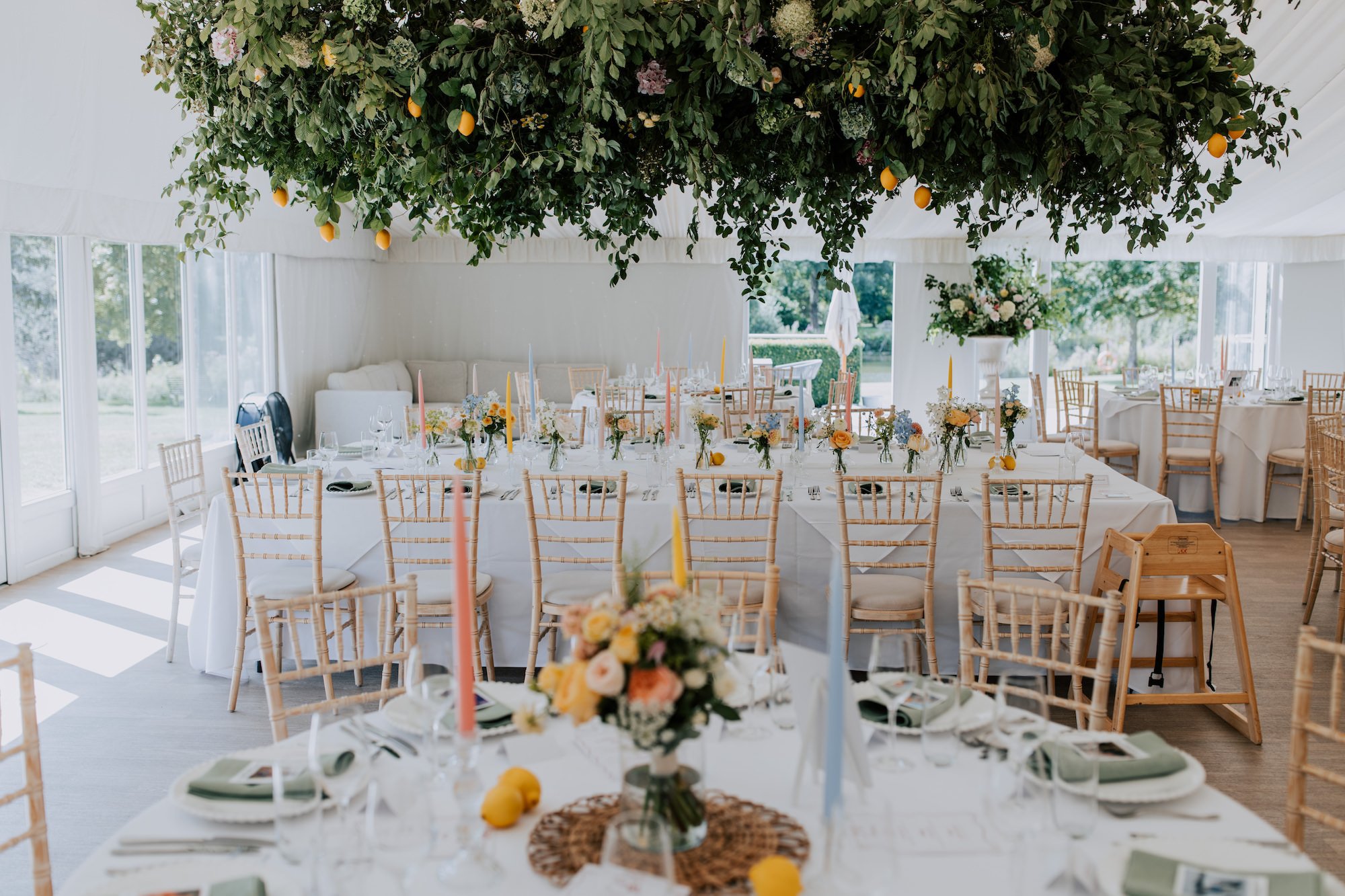
Remember the colour wheel? Greens and blues are cool colours, so naturally a blue scheme against a green background will mean your photos will have a cool hue and tone . Chuck in a pop of colour such as orange, and they will be transformed.
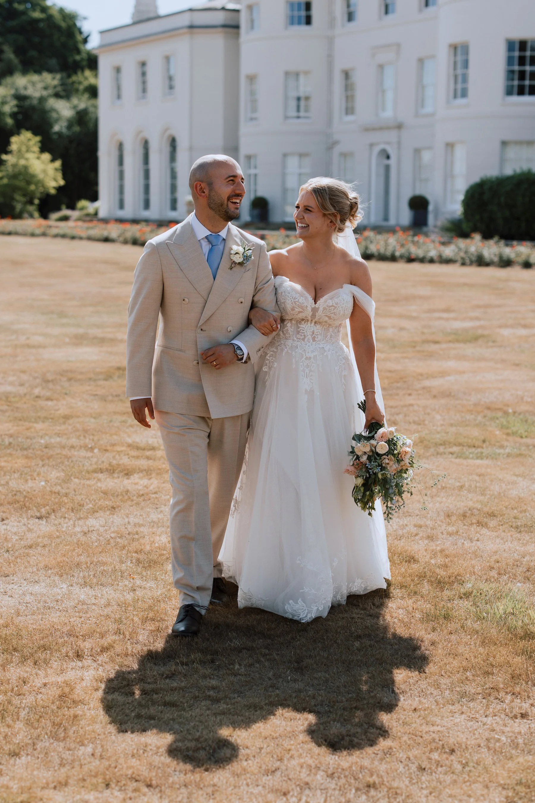
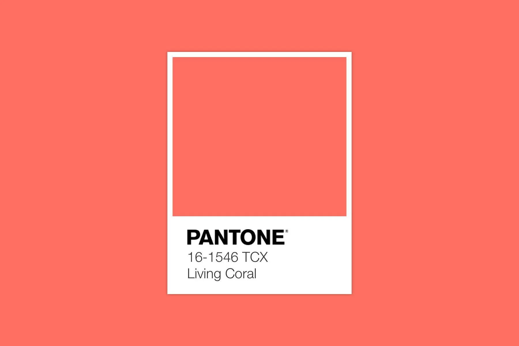
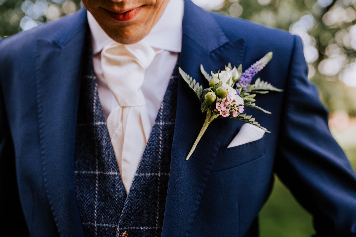
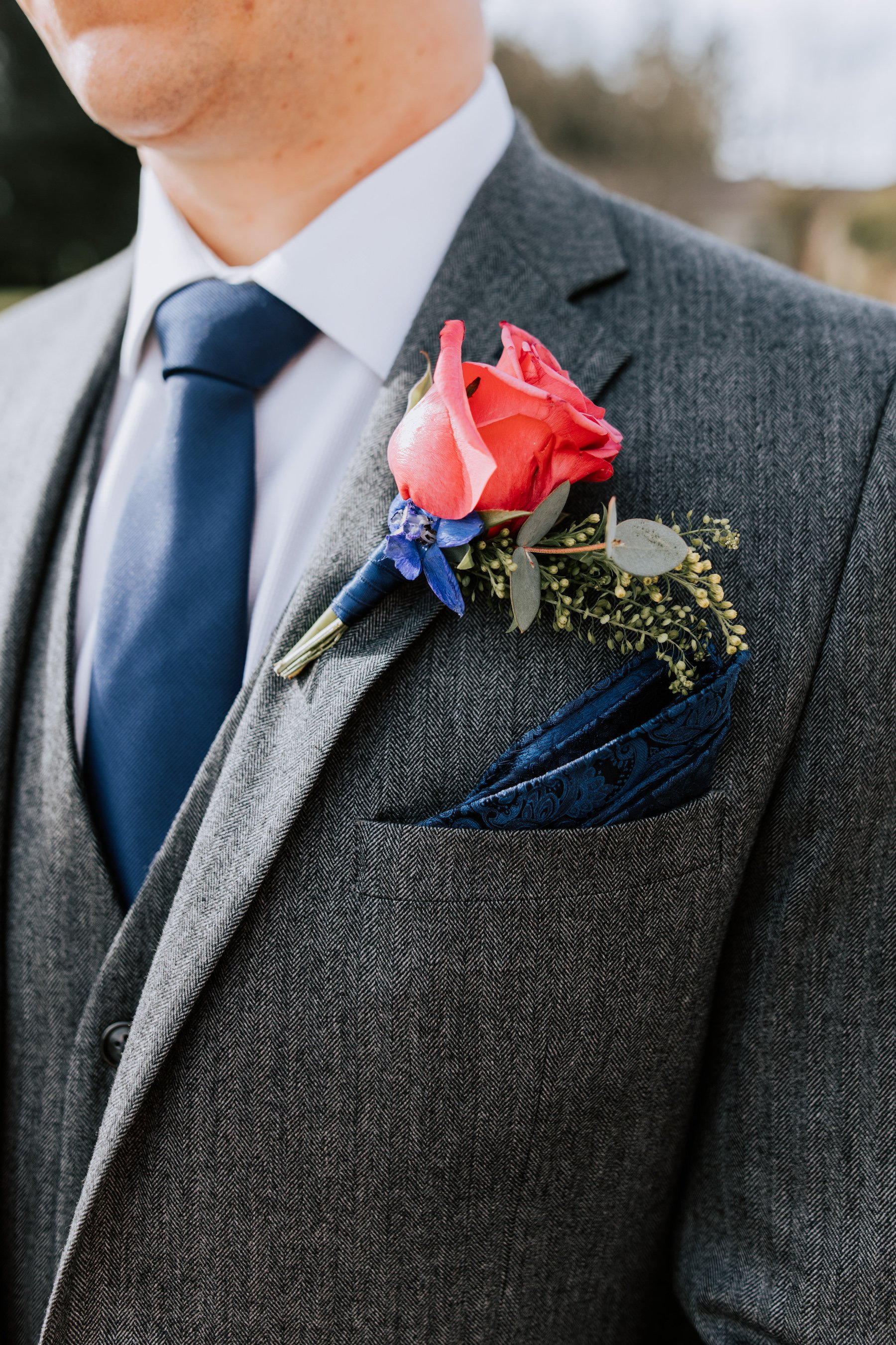
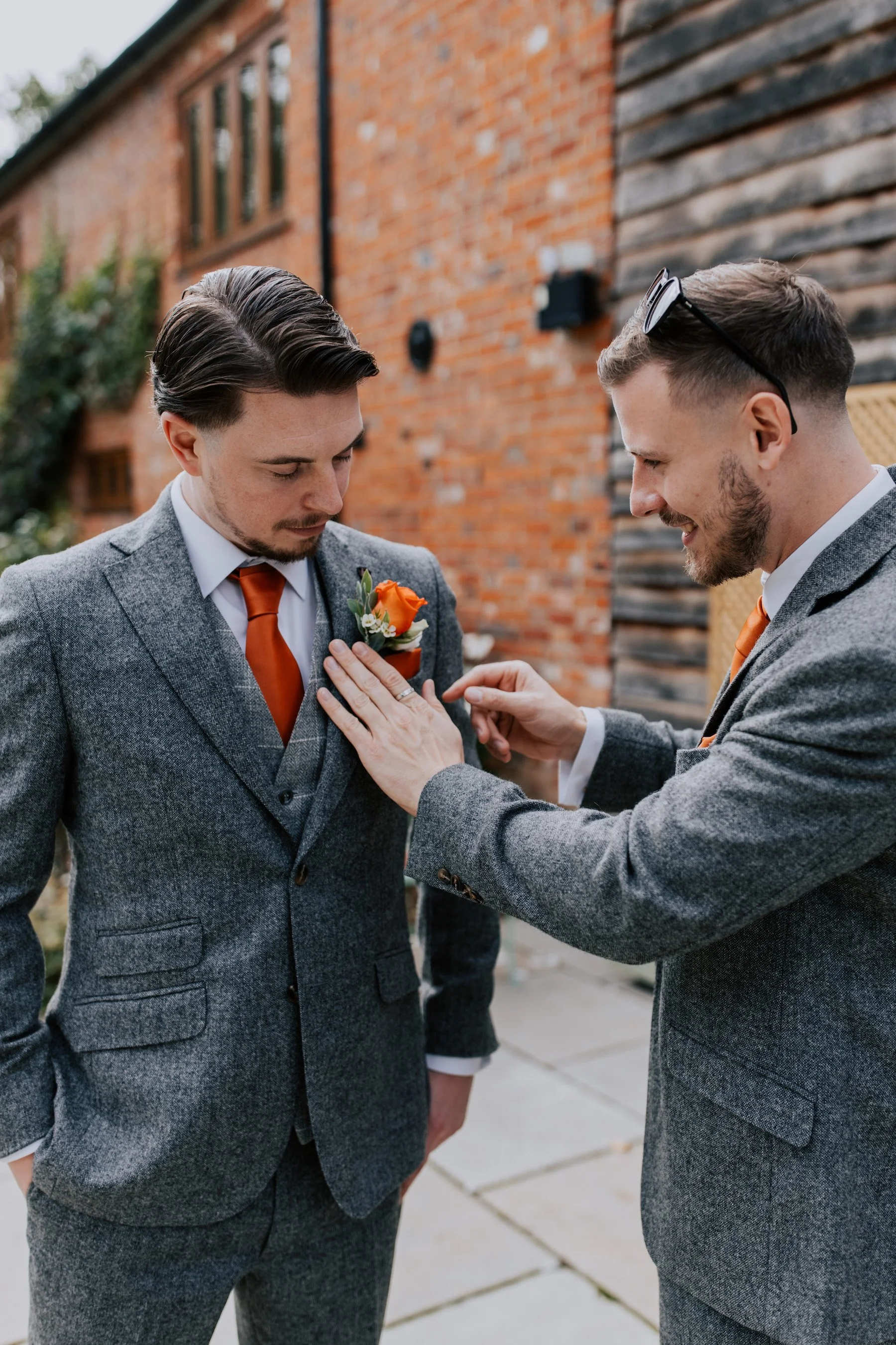
For something fresh, consider teaming the gents’ blue suits with a patterned orange or yellow tie and handkerchief, or even Pantone’s 2019 colour of the year, coral:
I’m Blue Da-ba-dee-da-ba-di
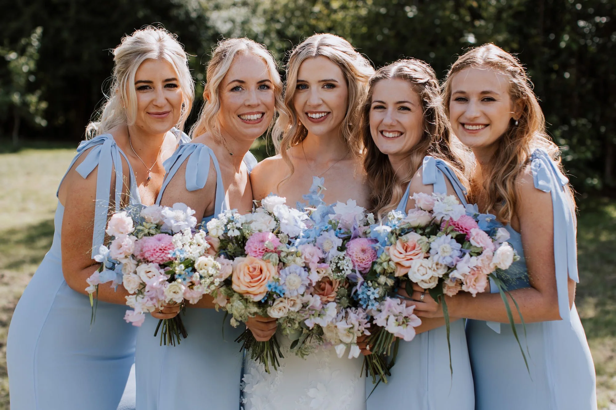
Despite being my favourite colour, blue can sometimes make photographs look cold, or suck the colour from images. I can’t tell you how many weddings I’ve photographed where nearly every wedding guest wore blue! Blue suits, blue shirts, blue ties, blue dresses, blue accessories. It made for some really blue wedding photos 😵💫
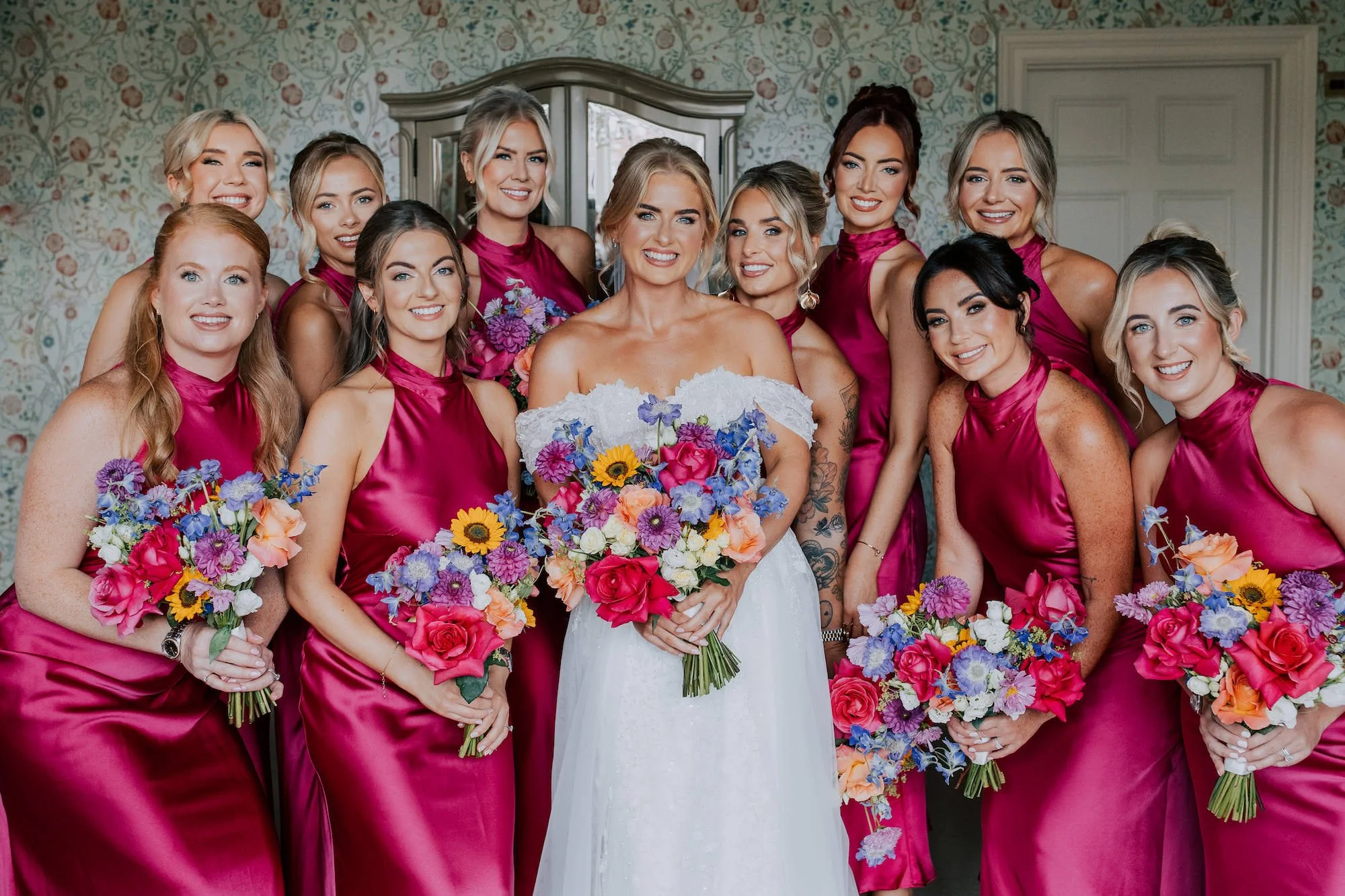
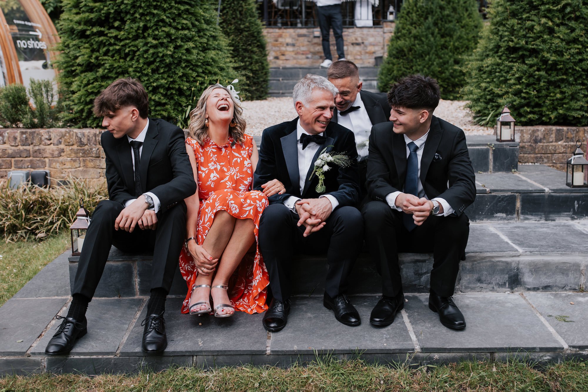
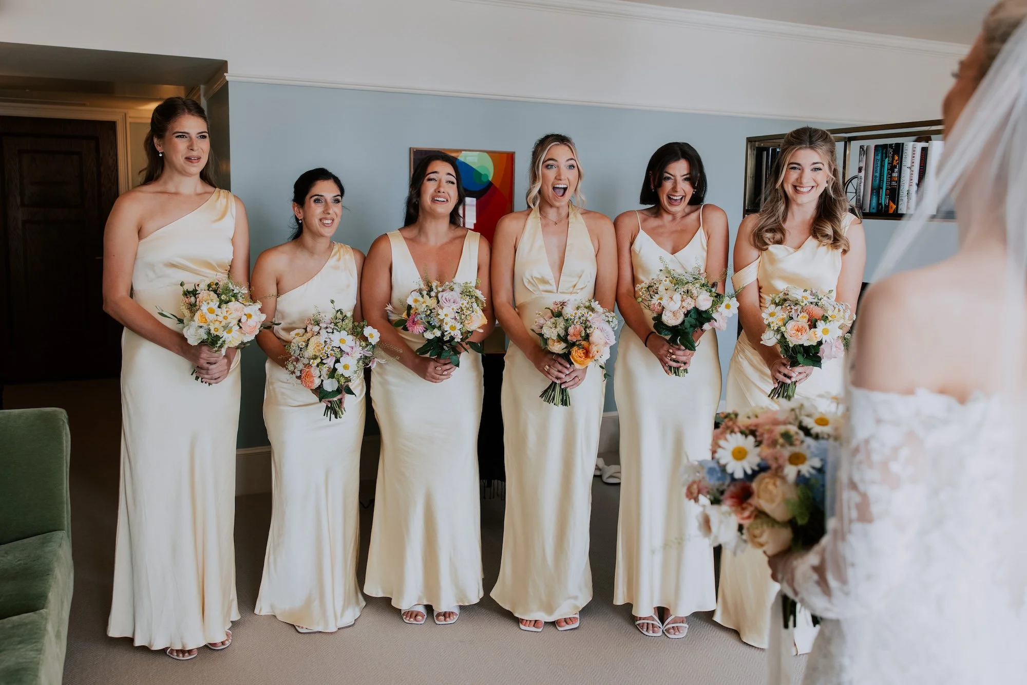
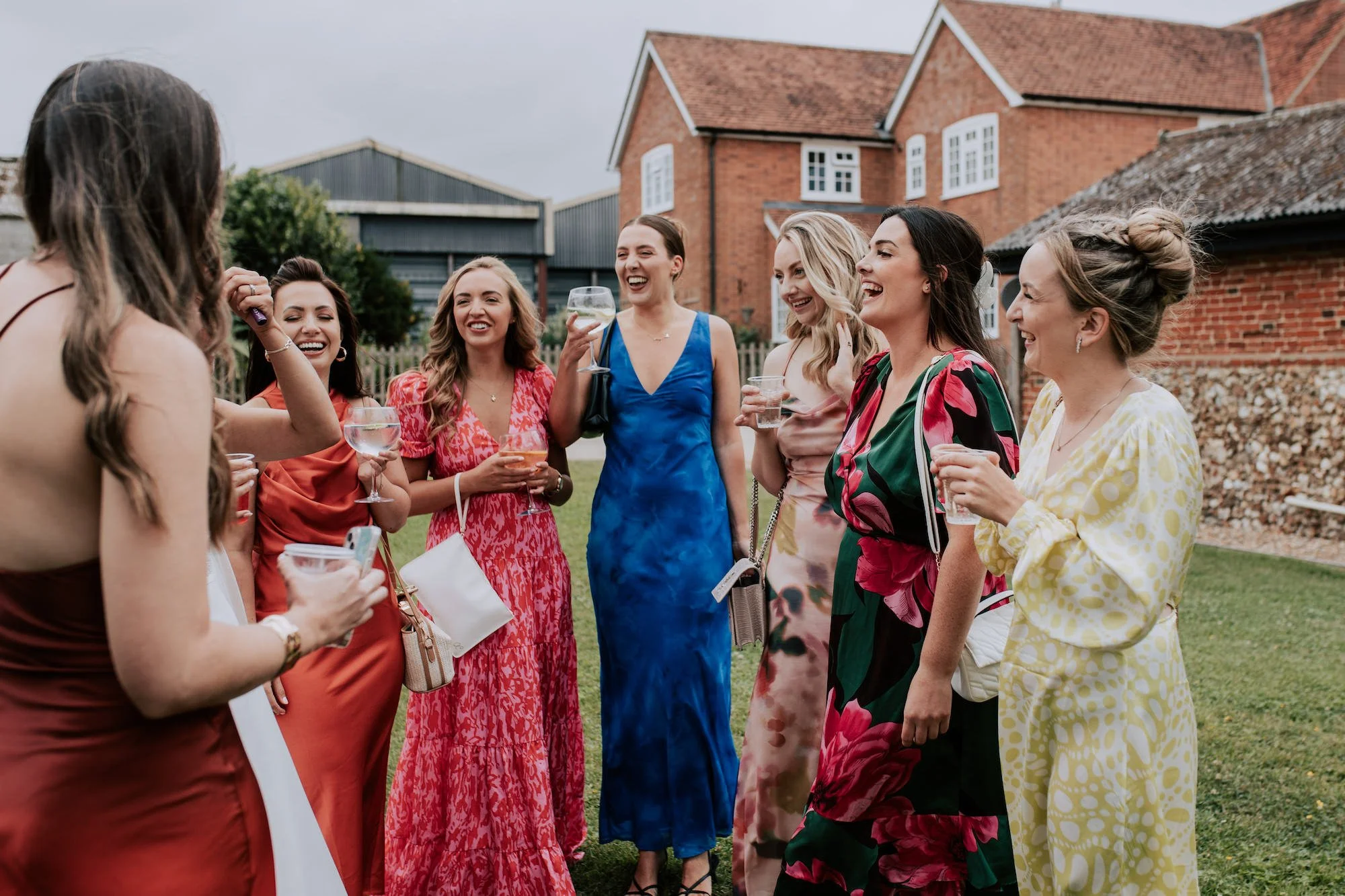
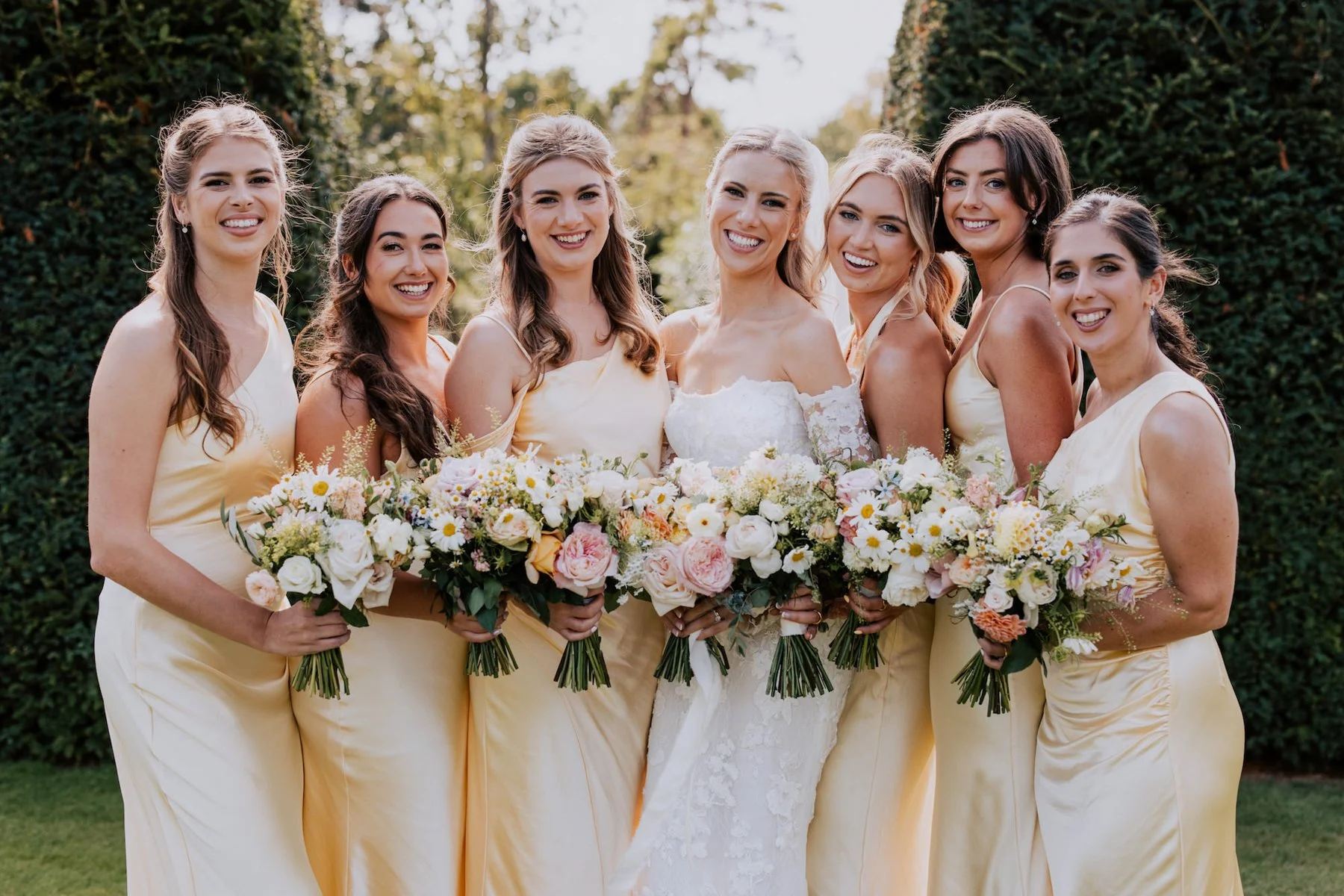
Think carefully about accessorising with a colour that will really make things pop. Consider going a step further and mentioning to guests that you’d love them to wear a pop of colour if they can, it really makes a difference. Below, gents were asked to wear black tie, and ladies were requested to wear colour:
How can I incorporate colour into my wedding?
I’m glad you asked.
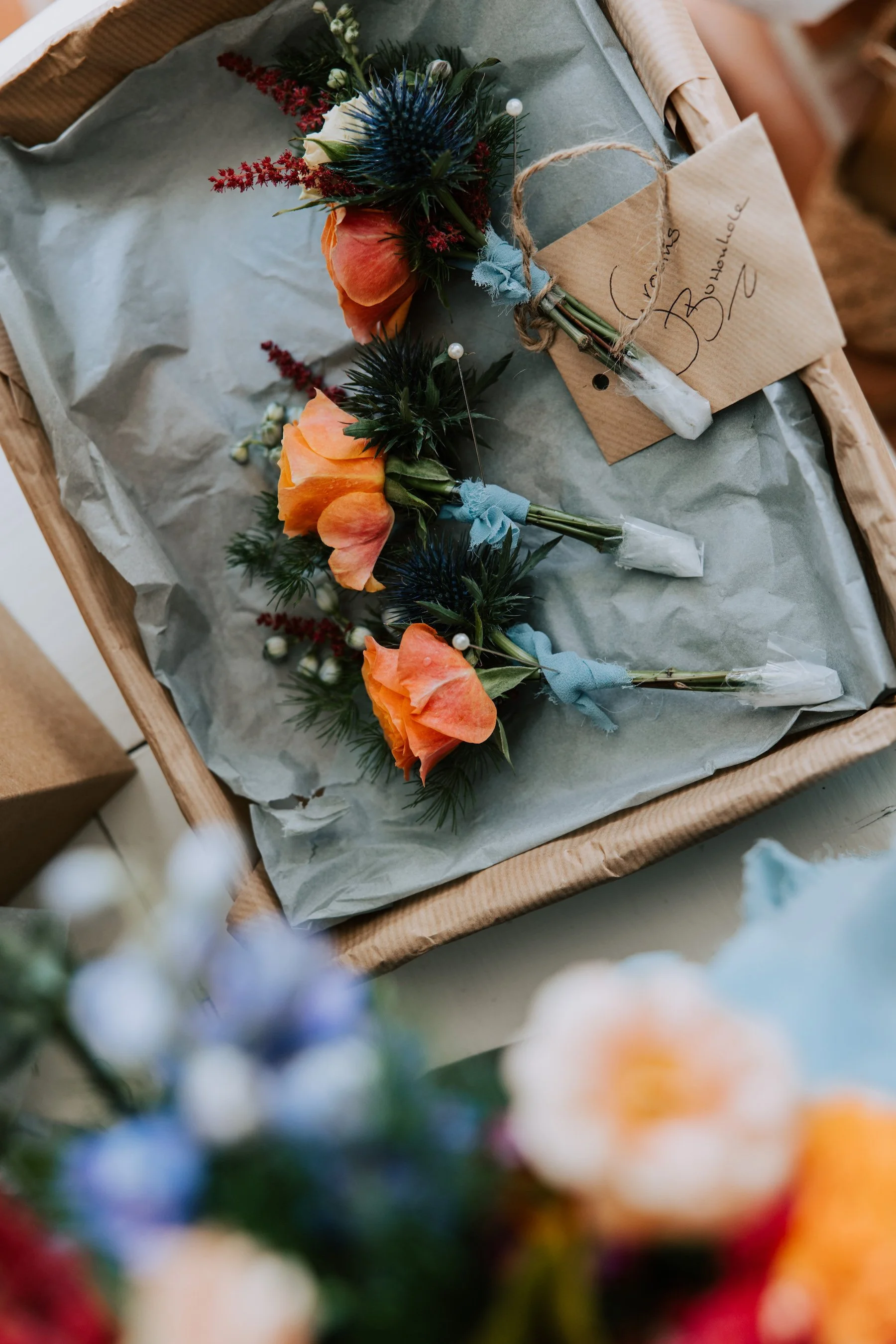
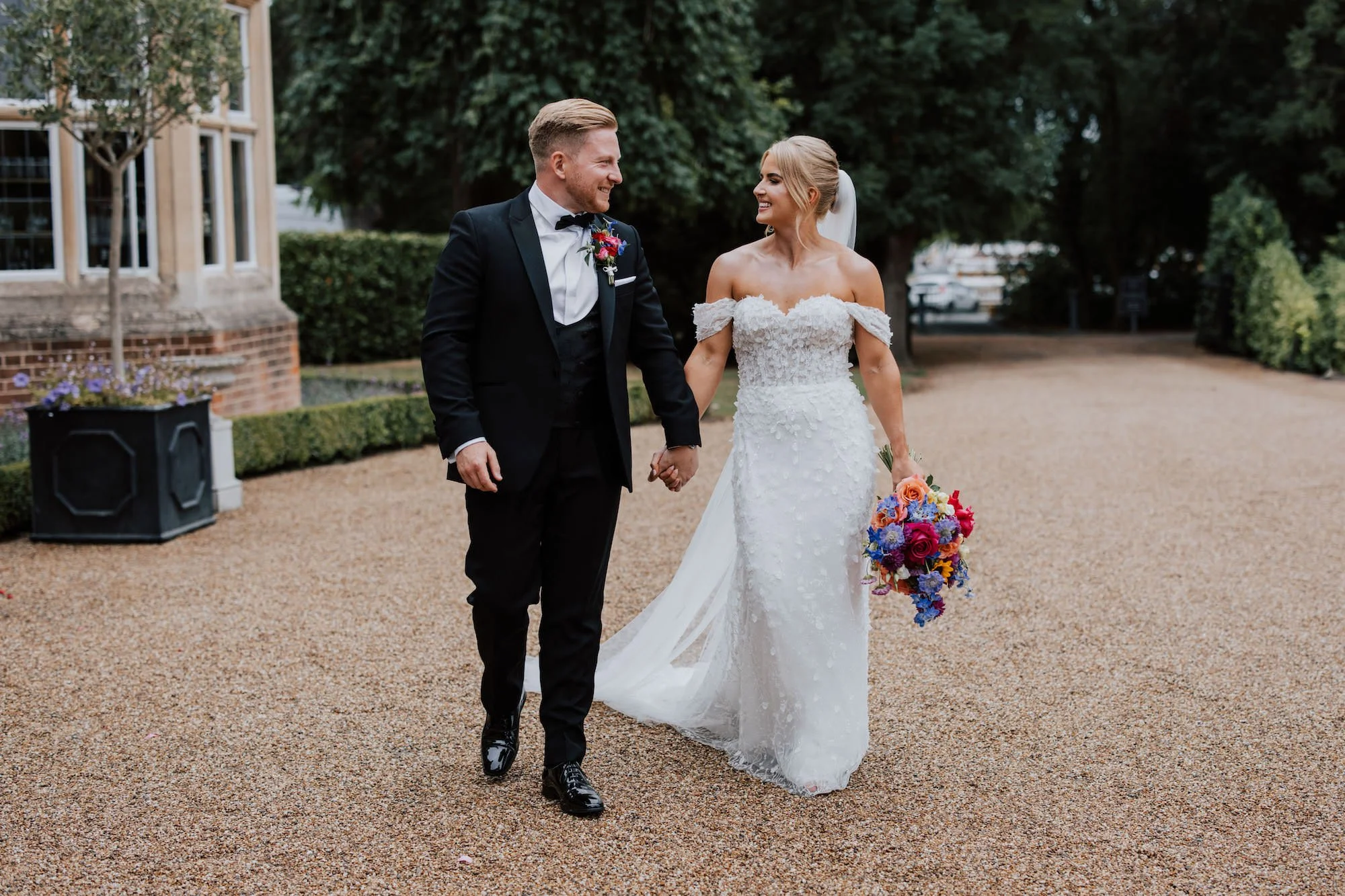
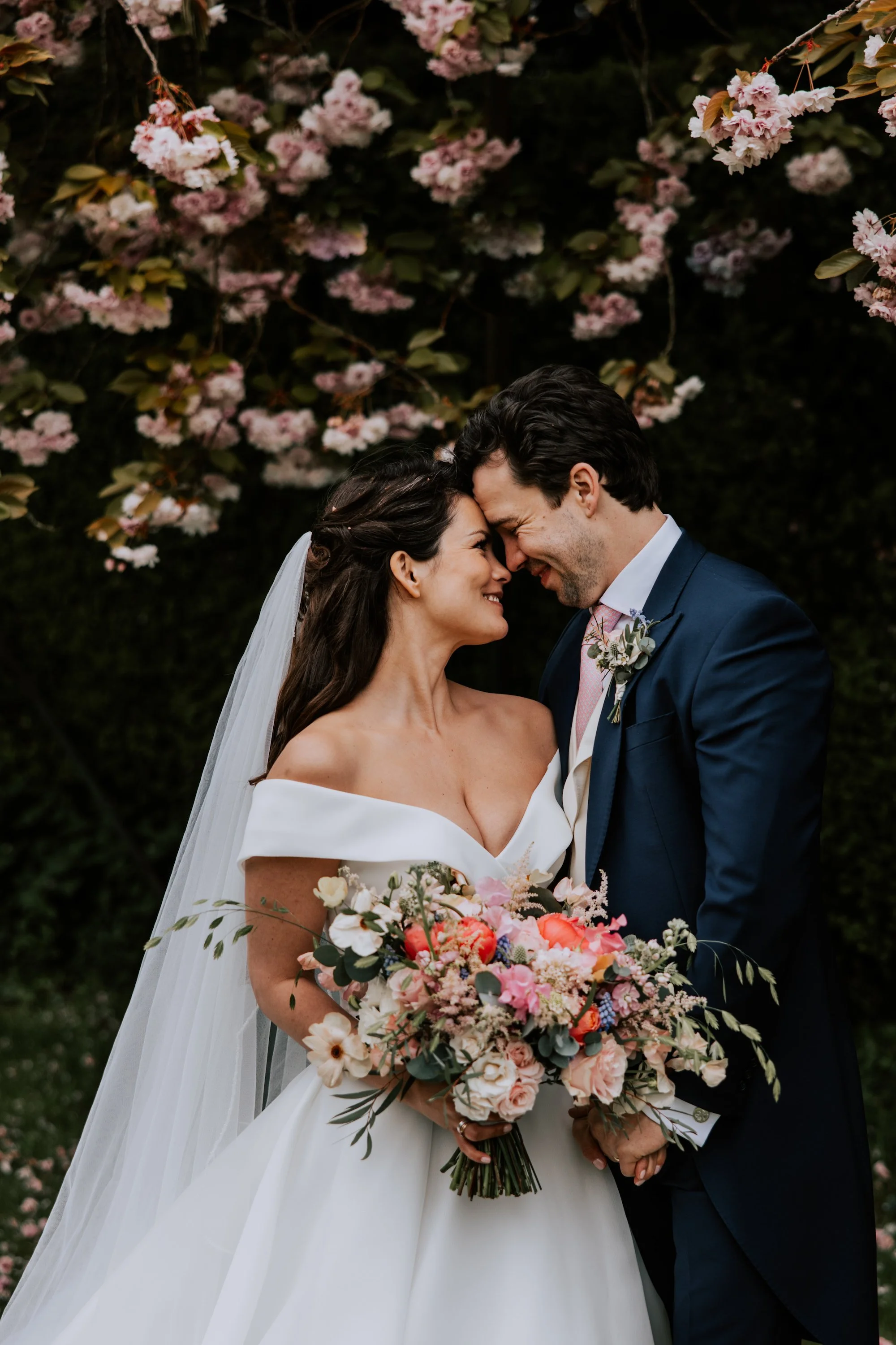
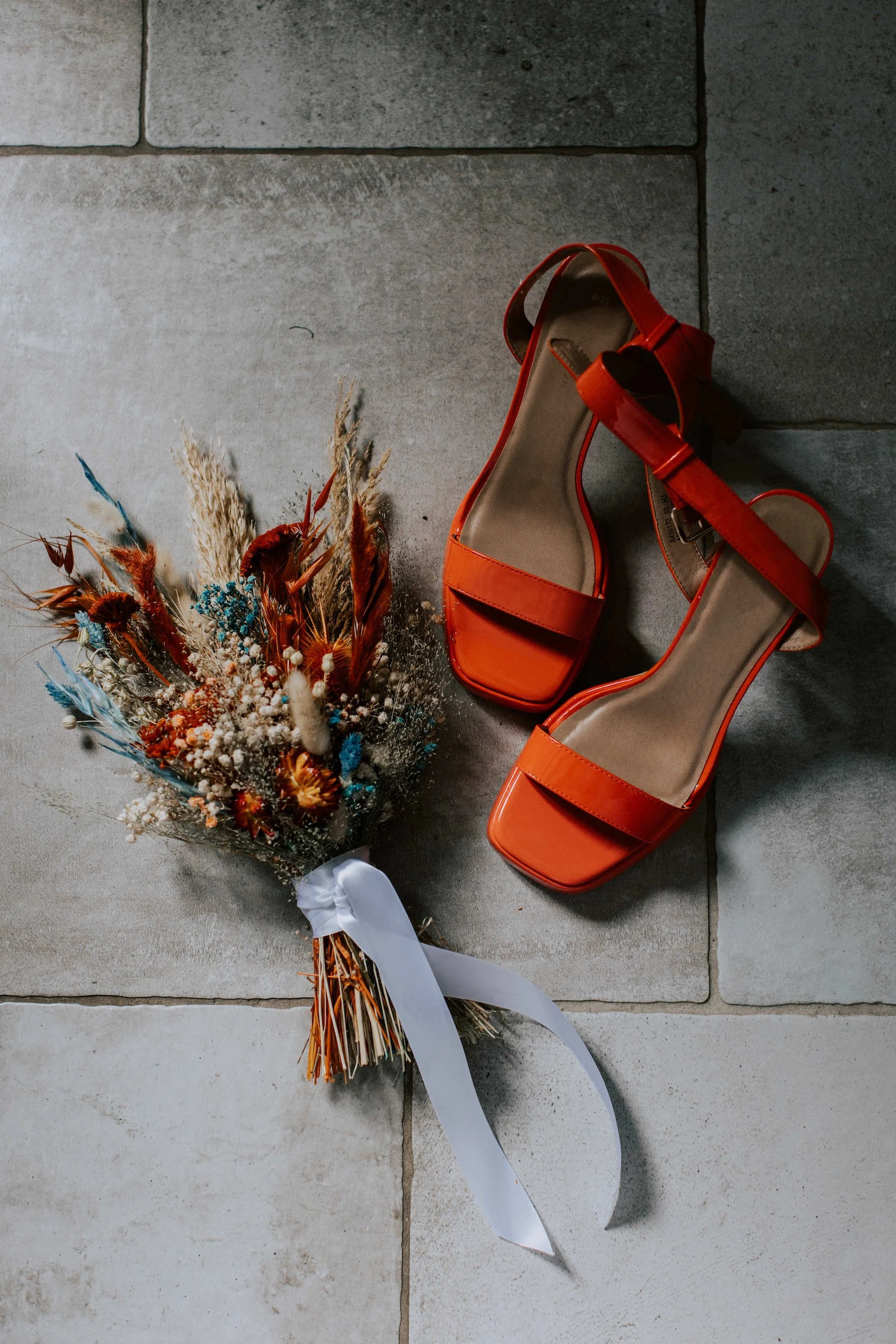
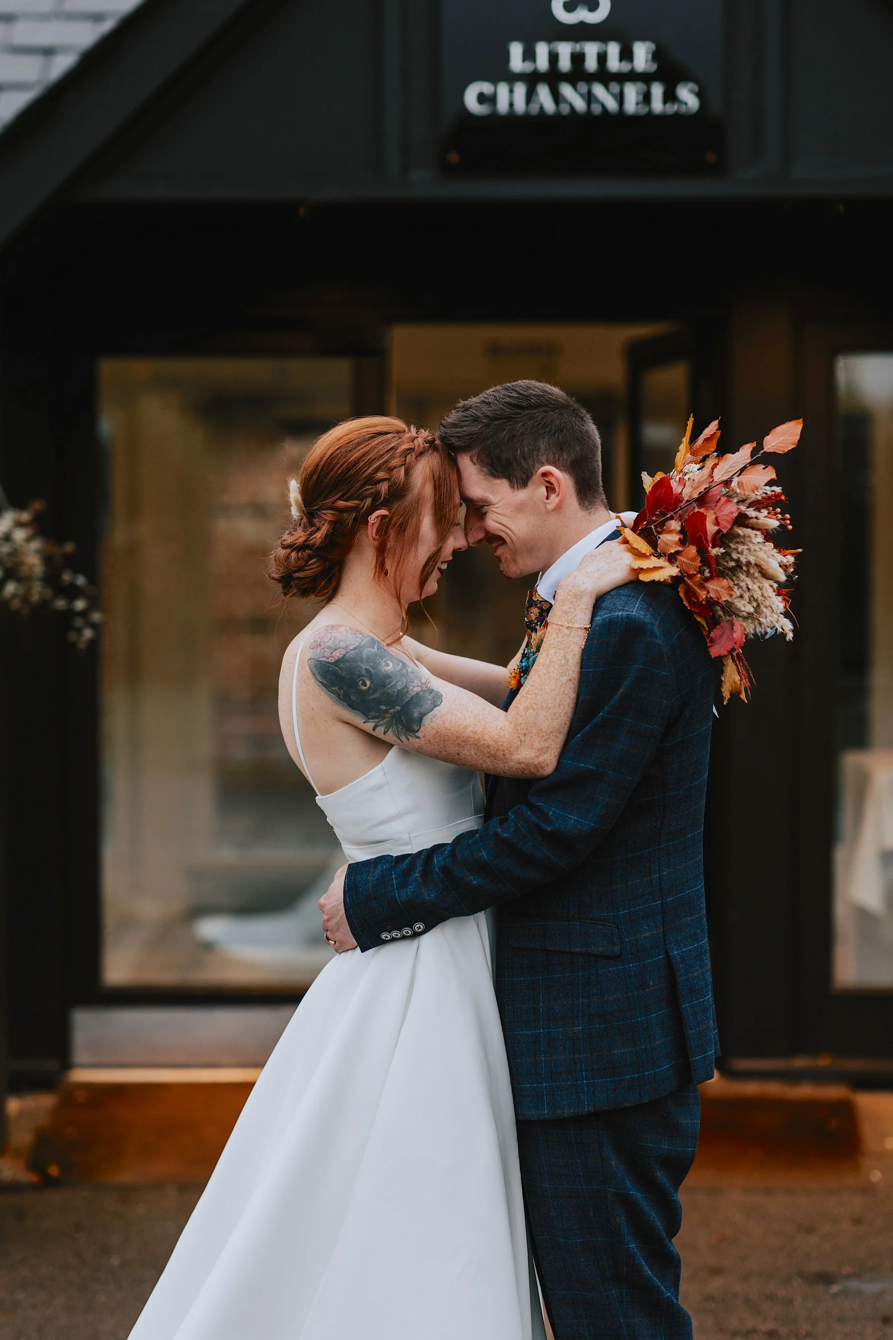
Outfits - suit, waistcoat, tie, pocket square, socks, shoes, all opportunities for colour/patterns.
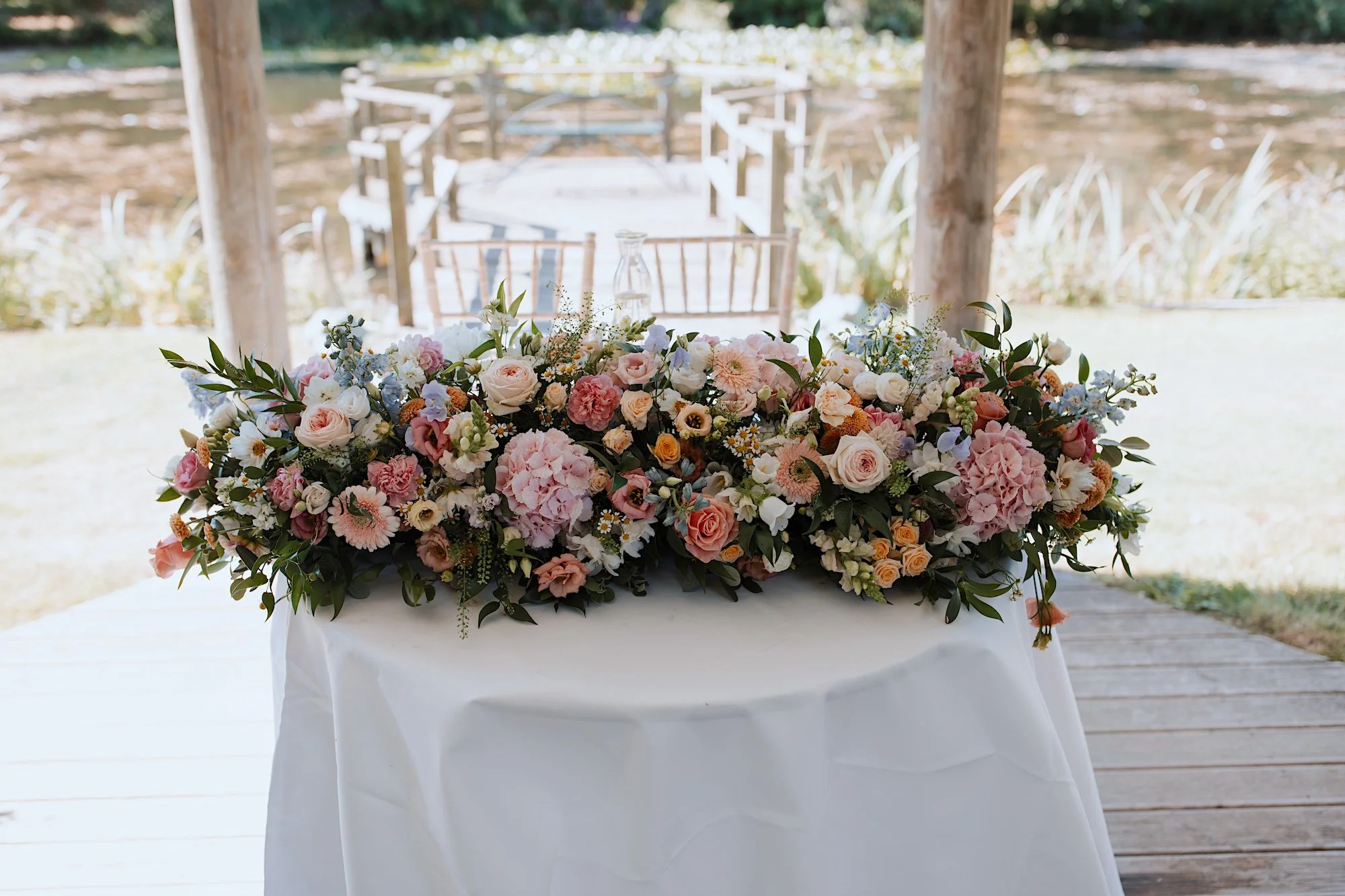
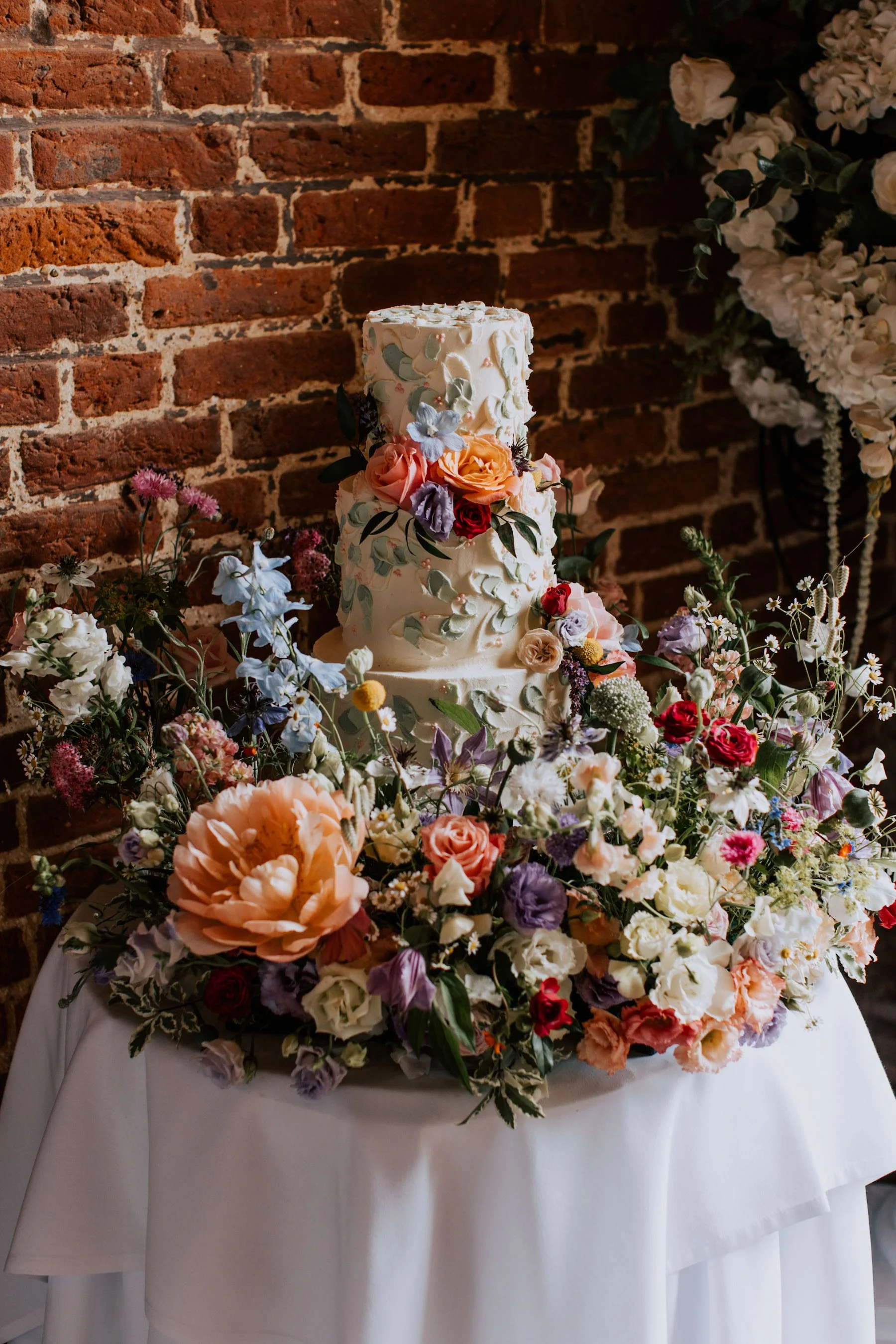
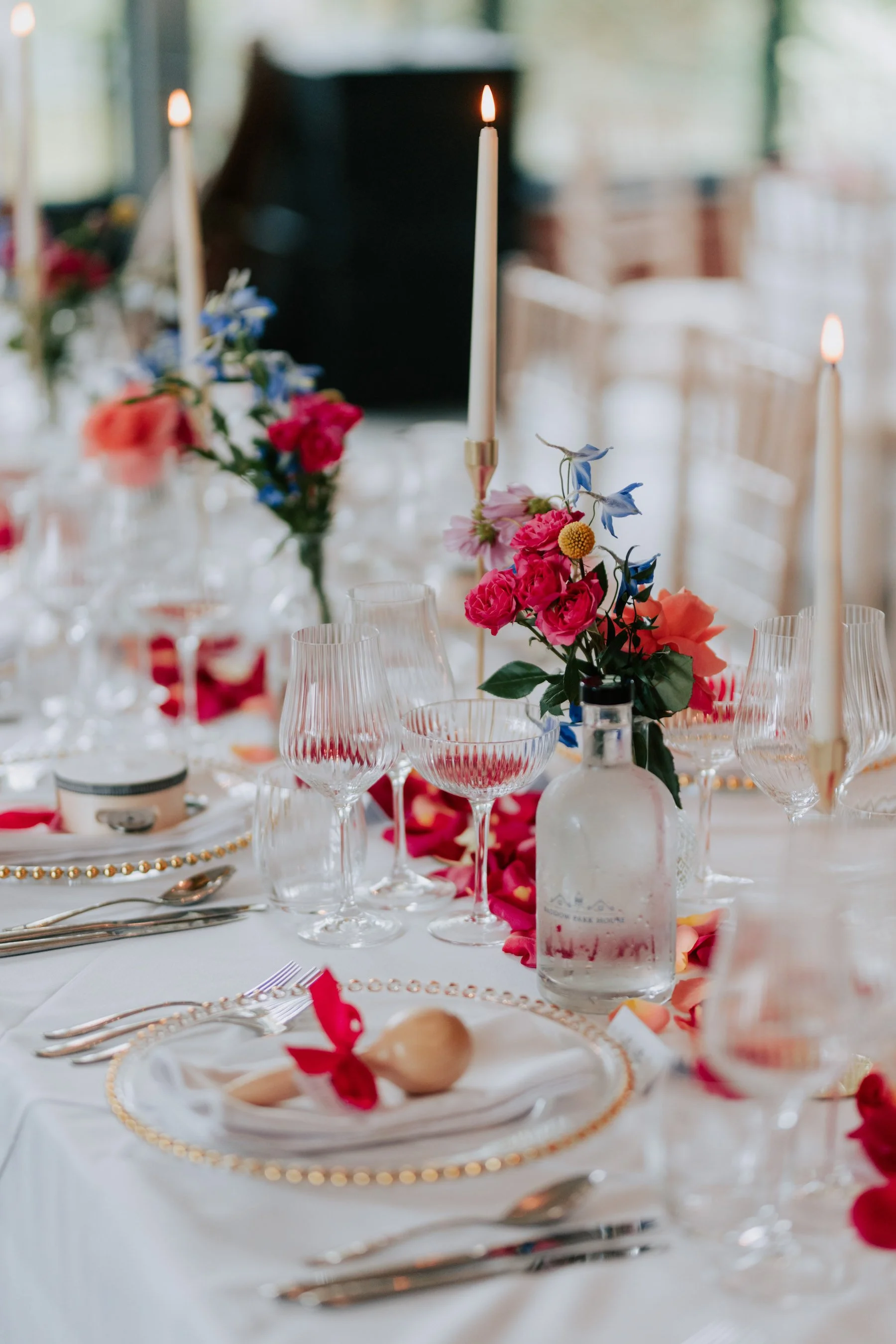
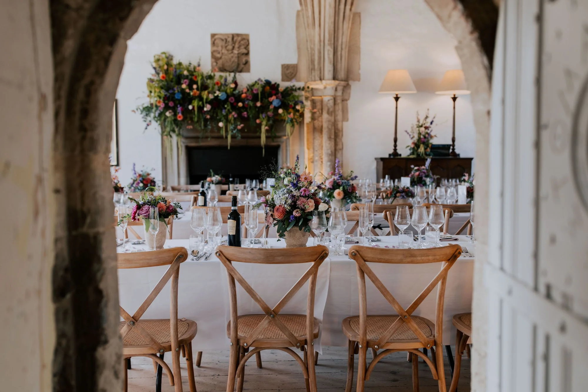
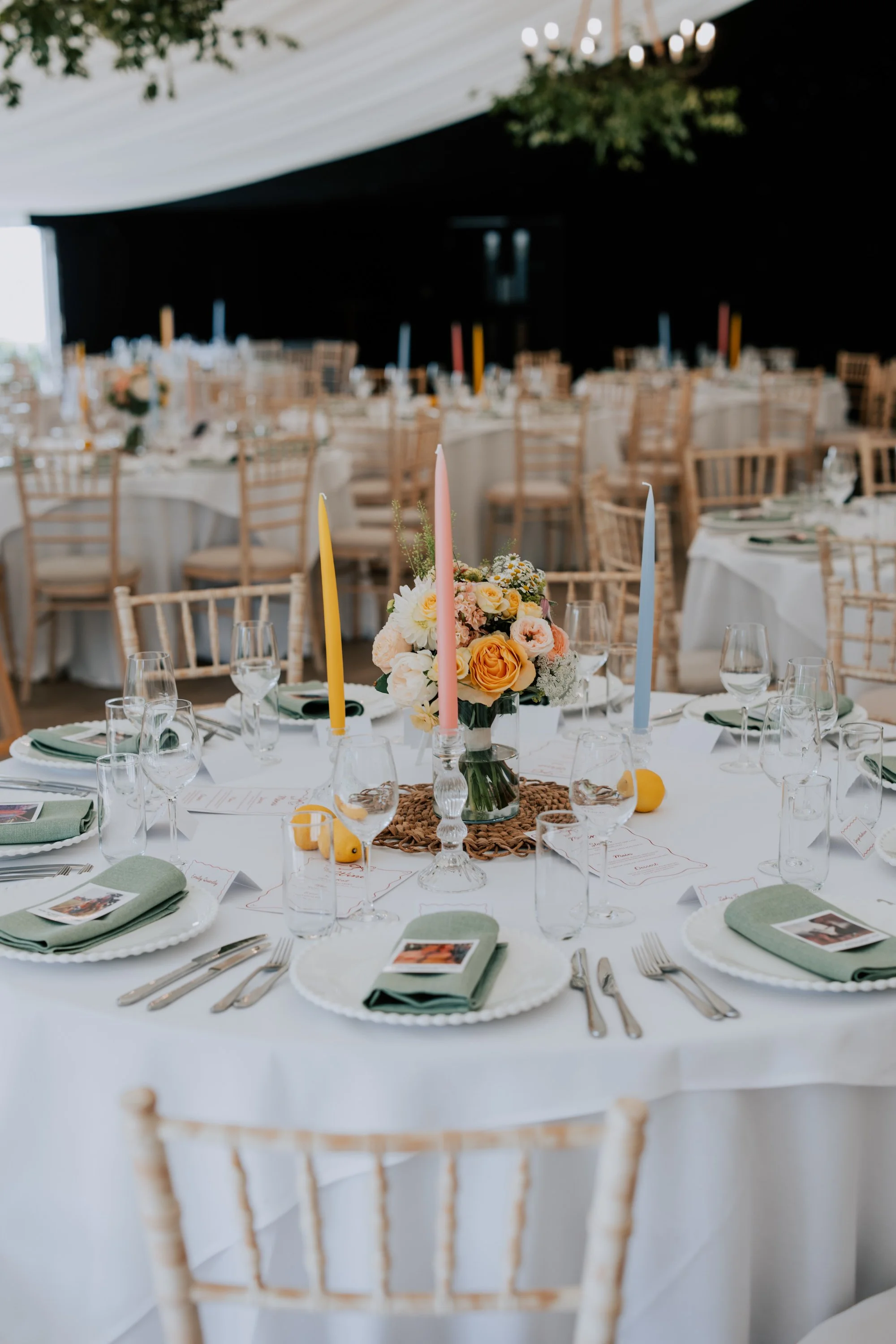
Flowers - bouquets, buttonholes, table decorations
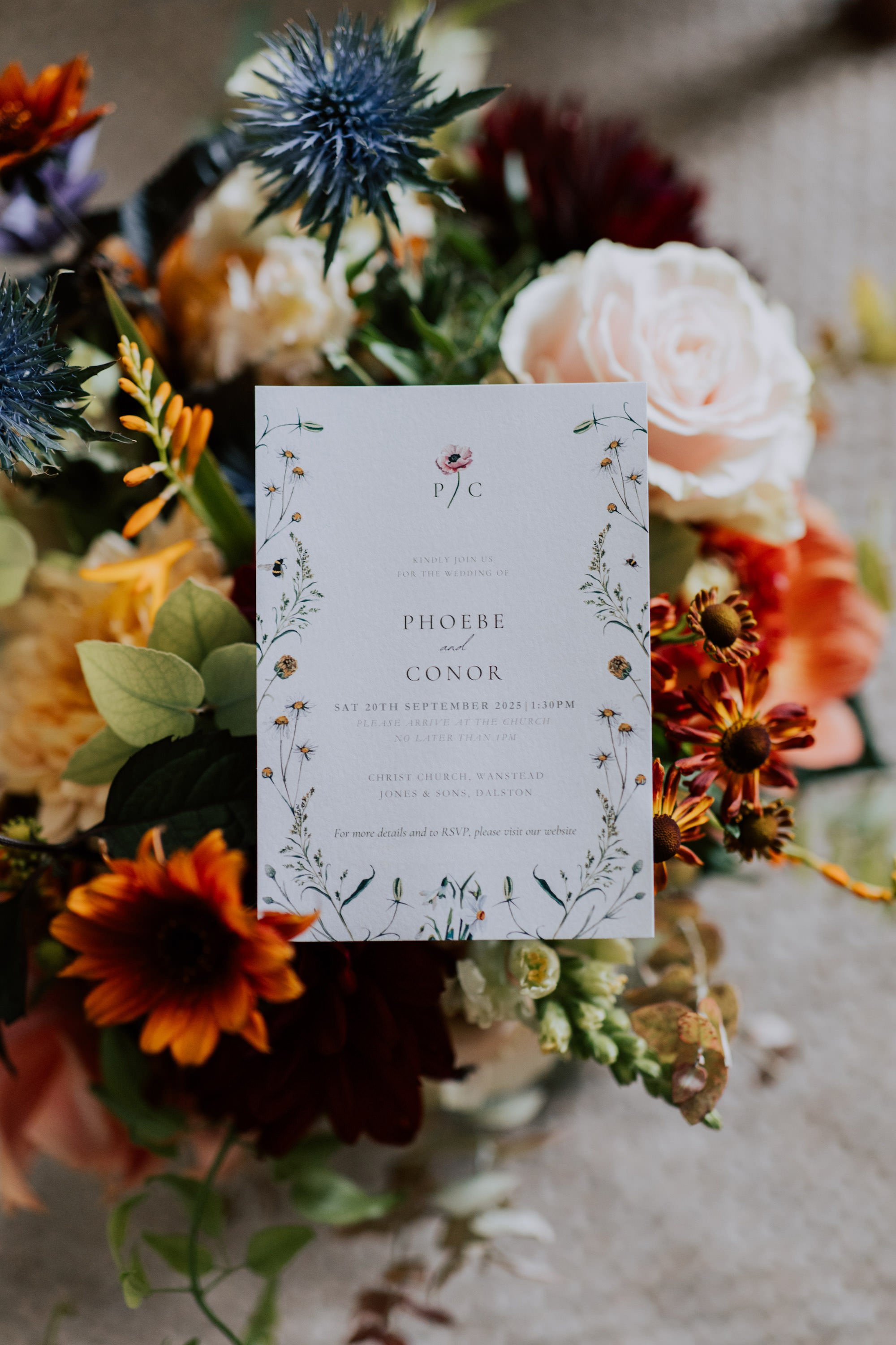
Signage and stationery - let your personality shine through with some colour
Venue decoration - table decorations, favours, flowers, tablewear
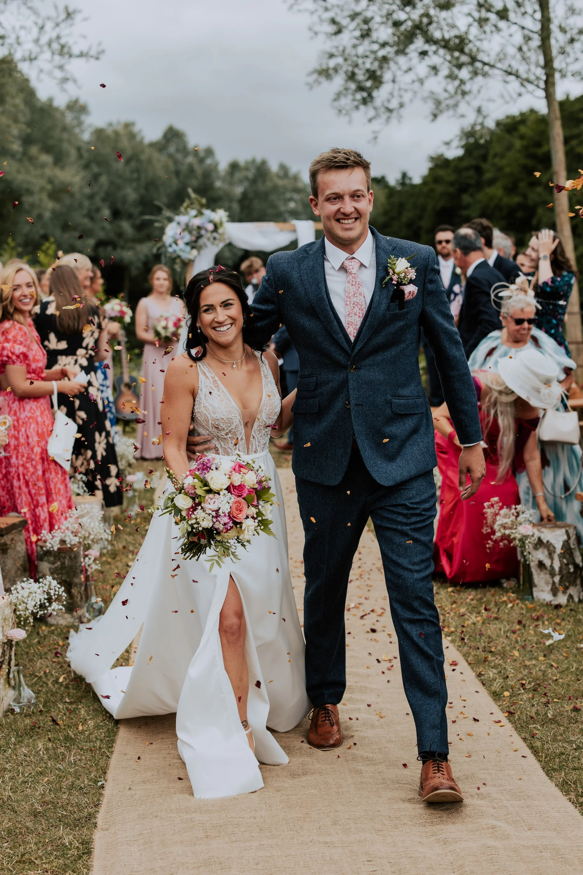
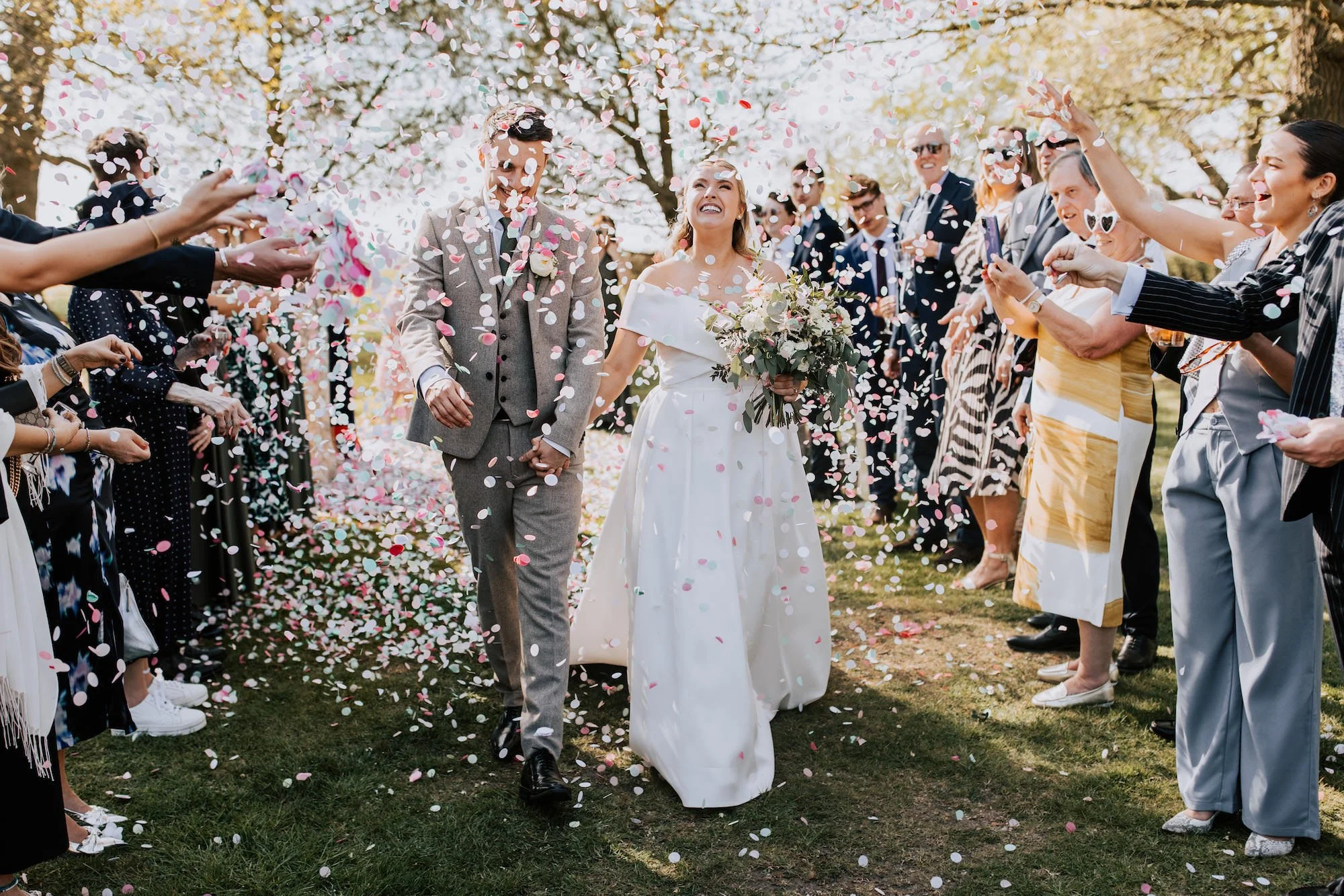
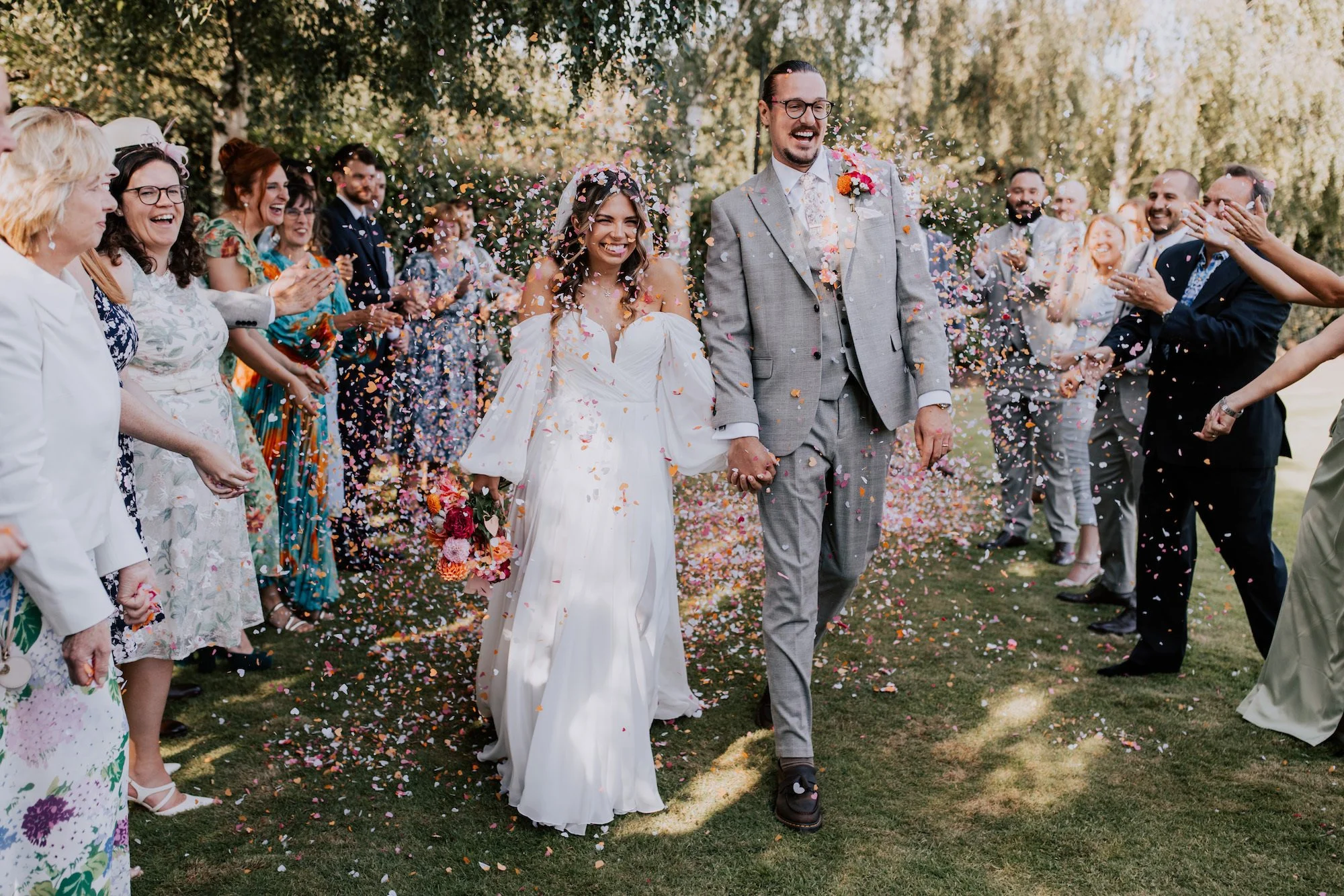
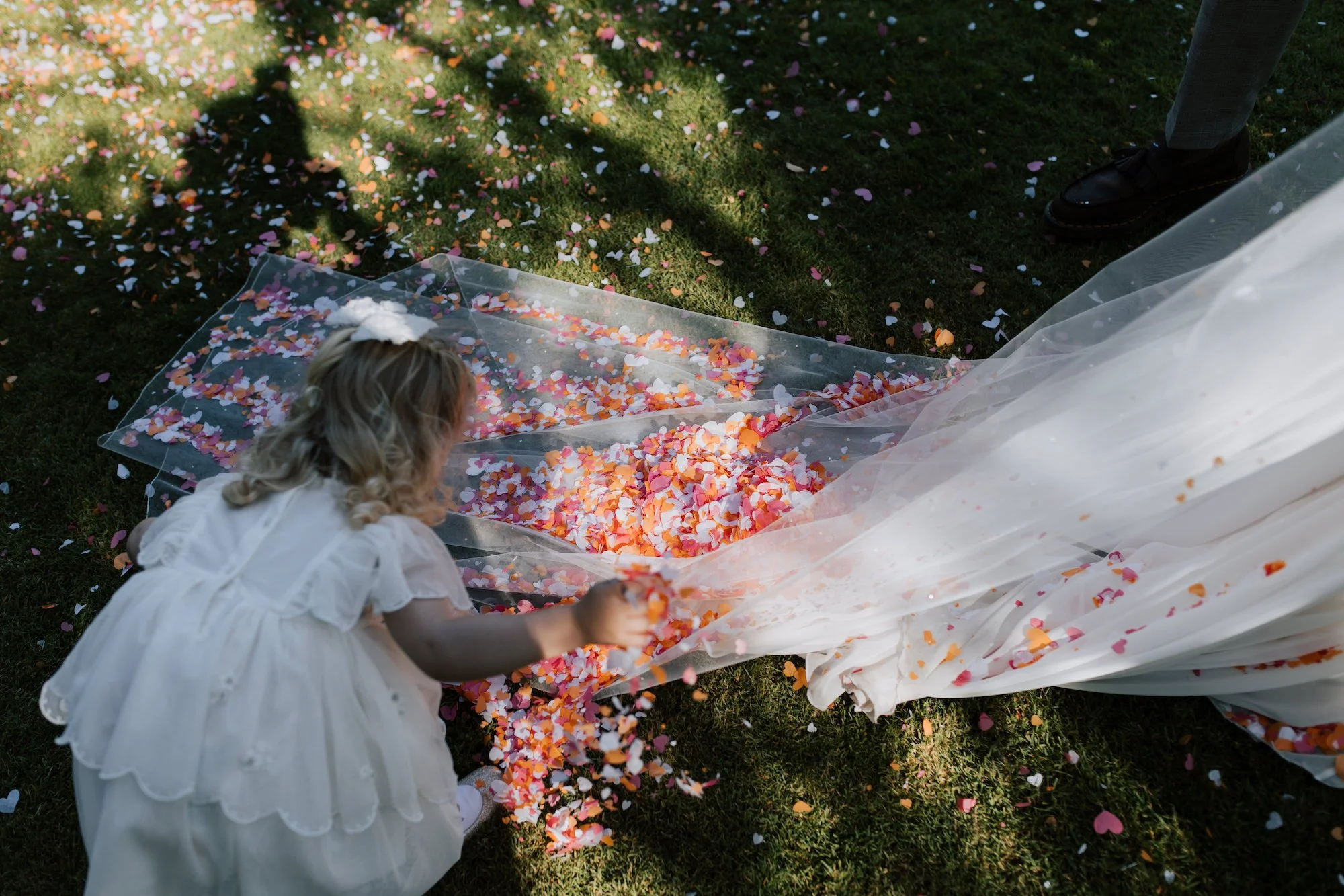
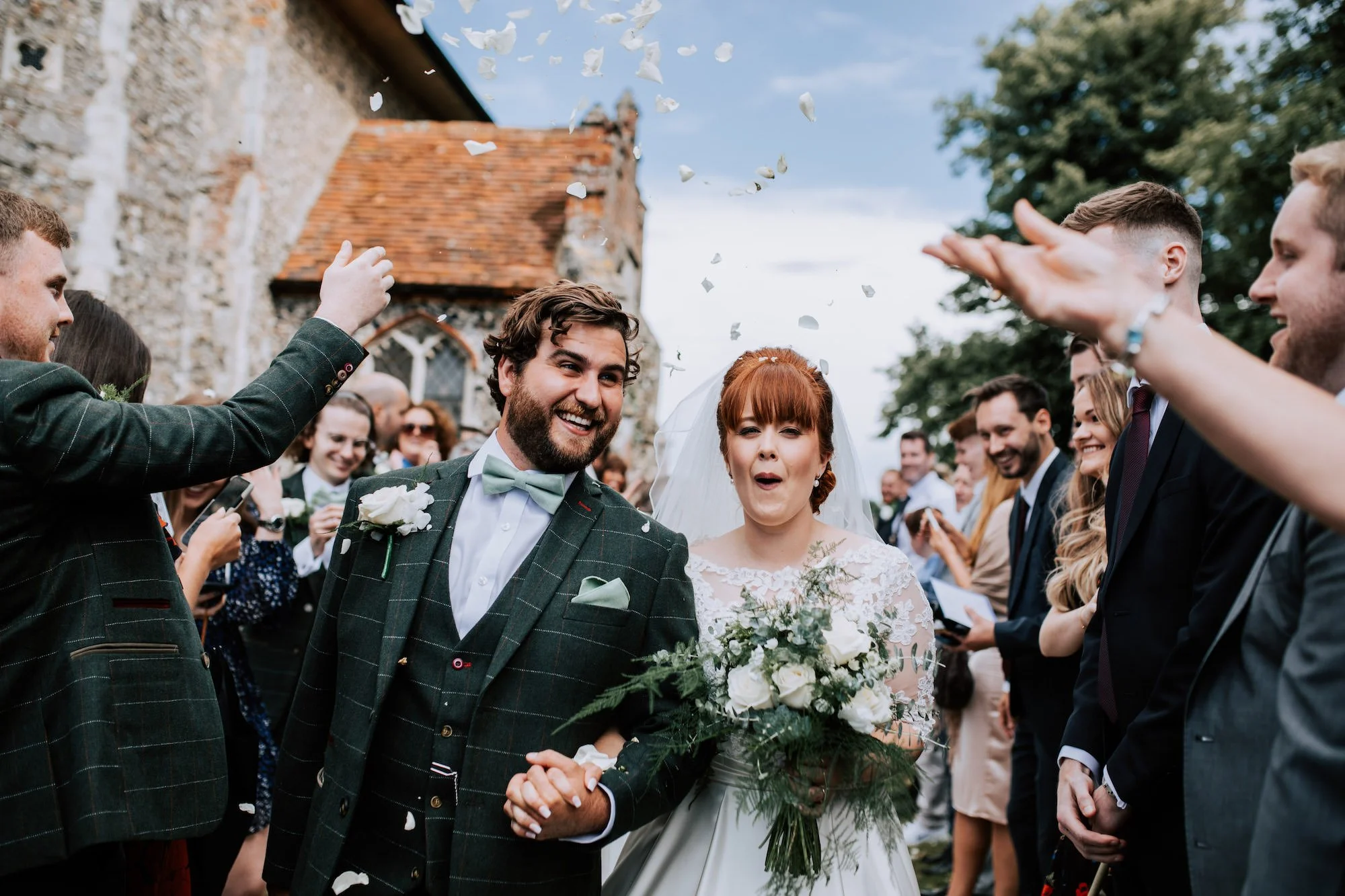
Aaaaand confetti. Lots of it!
Soooo many opportunities to inject a little colour and it will absolutely transform your photos! If you’re not sure where to begin, get yourself on Pinterest and start doing some research. If you’re feeling a little scared about chucking in random colours, chat to your florist. Trust me, they will jump at the chance to produce a colourful scheme for you.
Other ways to make photos more vibrant
As ever, aside from the general vibe that you bring to your day (the energy you put out is returned by your guests) consider using different textures and patterns to inject some va-va-voom. Think breaking up the menswear with a waistcoat and tie different to the suit with a different pattern / colour. Table decorations and signage can be a great place to signpost how you want the vibe to be.
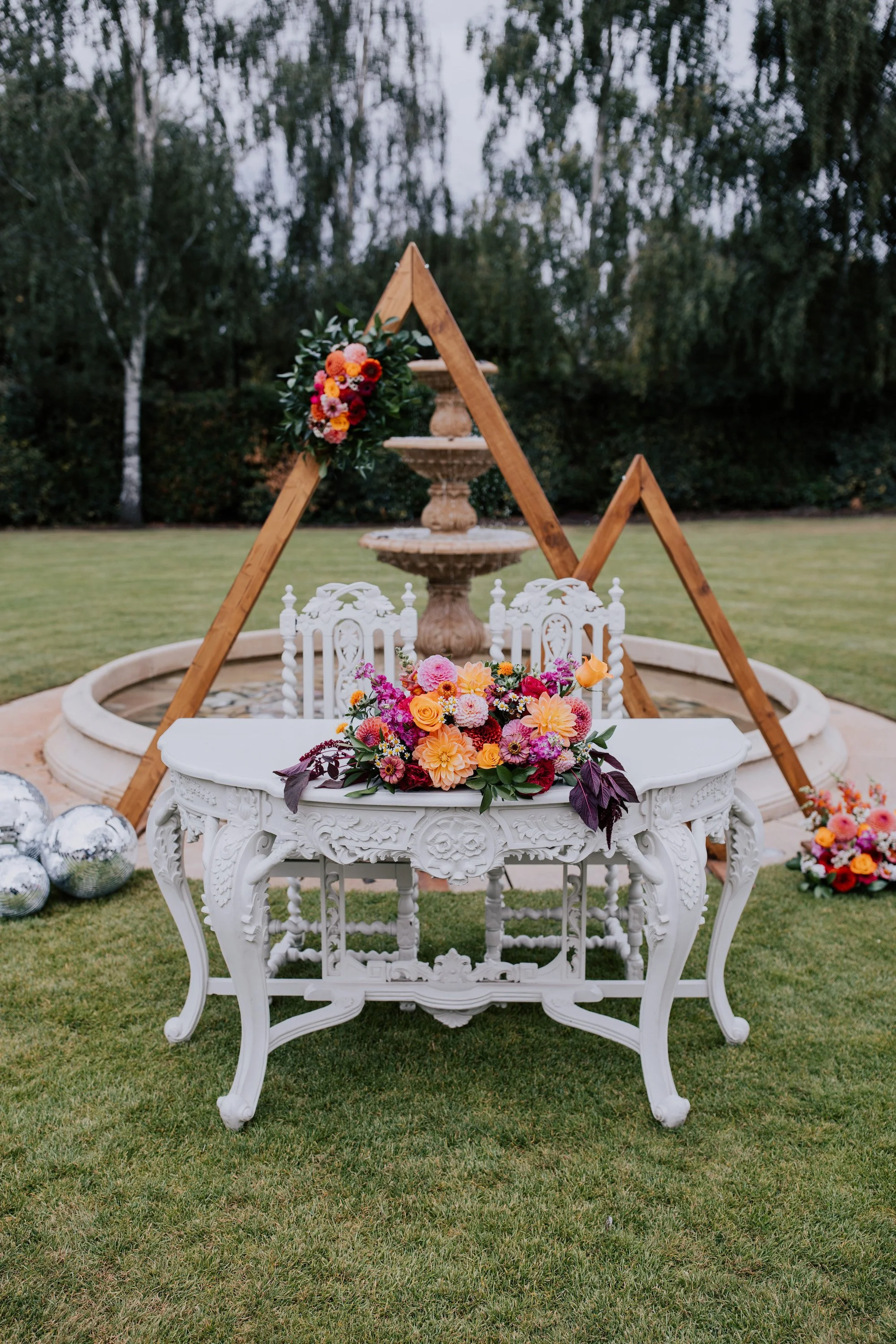
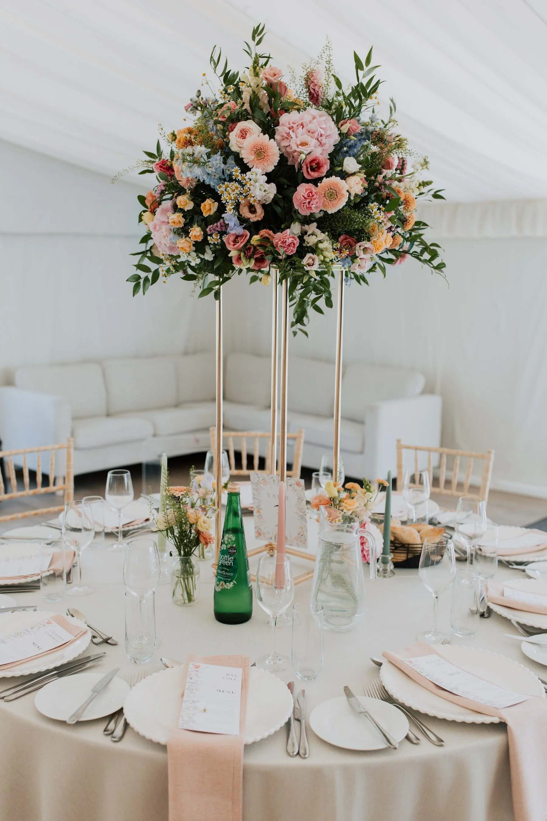
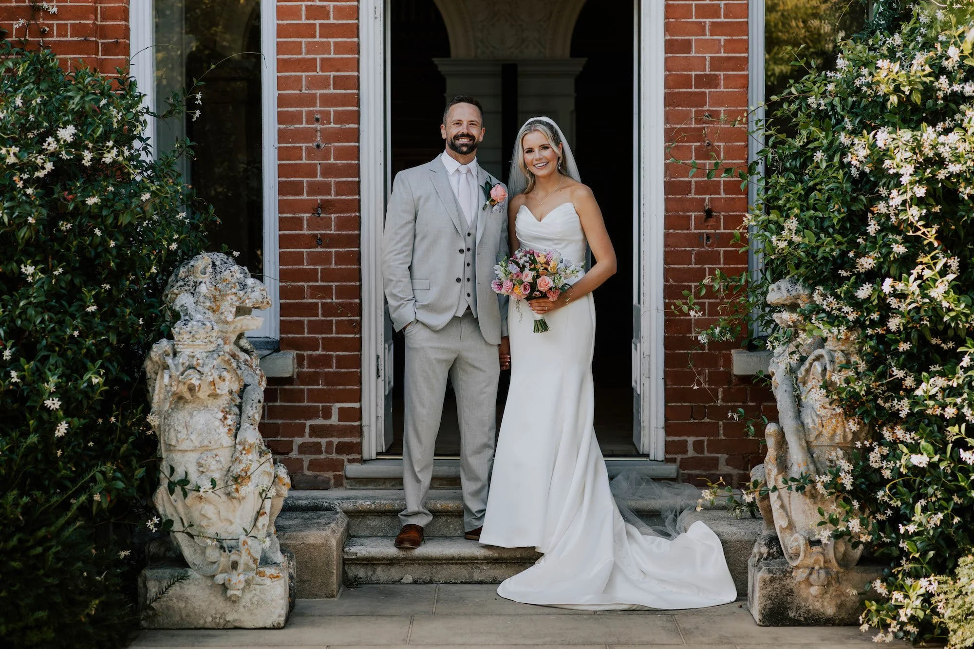
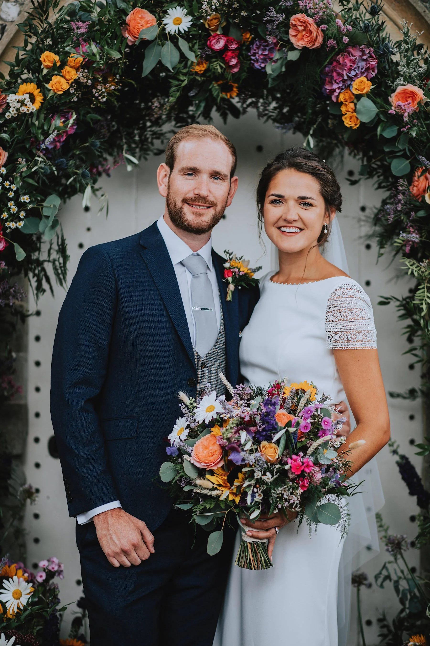
Here’s some more inspo for adding some colour to weddings. Enjoy!
Hey listen; whatever you decide to do, I’m sure it’ll look fab. Variety is the spice of life and there’s no rules to this thing! (Apart from dogs are mandatory at all weddings, OK?)
As always, thanks for reading, and feel free to share this with your Bride Tribe or Wedding Squad if you found it useful.
If you want to see a recent example of a real colourful wedding I’ve photographed, you can see it HERE